
Project
Our aim was to modernize ABE Energy branding and packaging to resonate with a U.S. audience while maintaining the brand’s bold UK identity. The refresh incorporated a new brand logo, reflected current design trends, and supported expanding ABE’s flavor portfolio through licensing collaborations.
Services
Packaging
Brand Refresh
Product Rendering
Branding
Marketing Collateral
Web Design
Brand Therapy
The Challenge
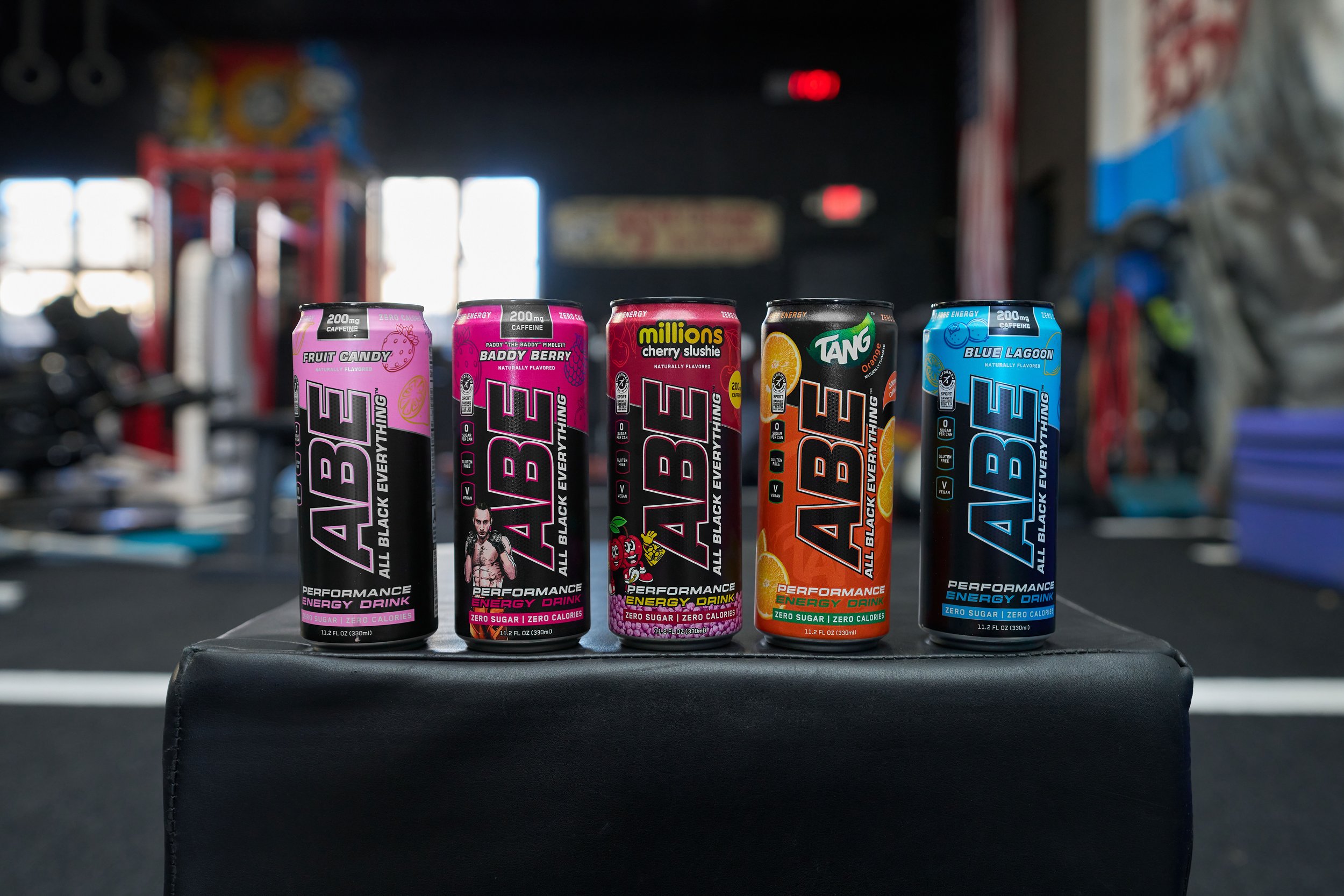
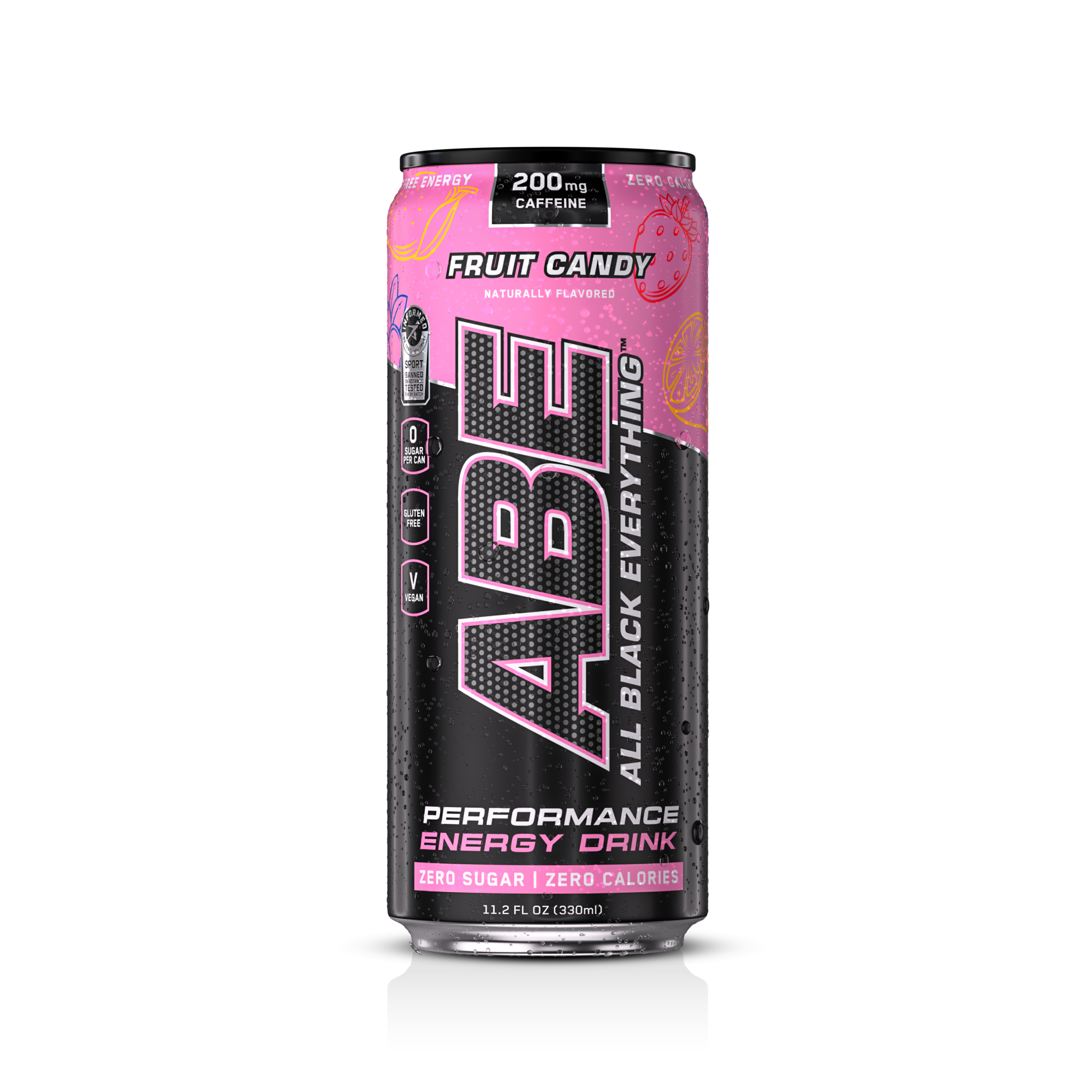
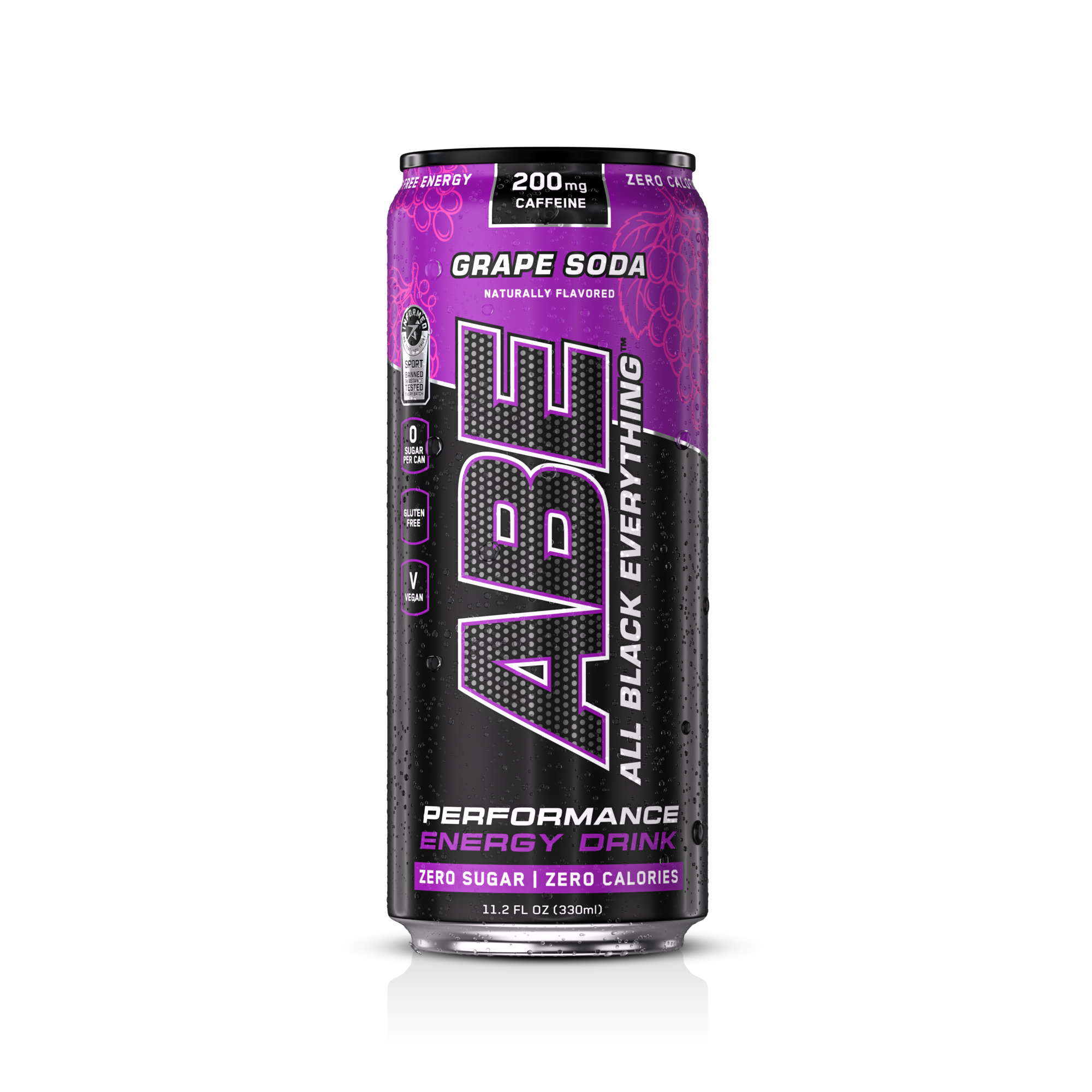
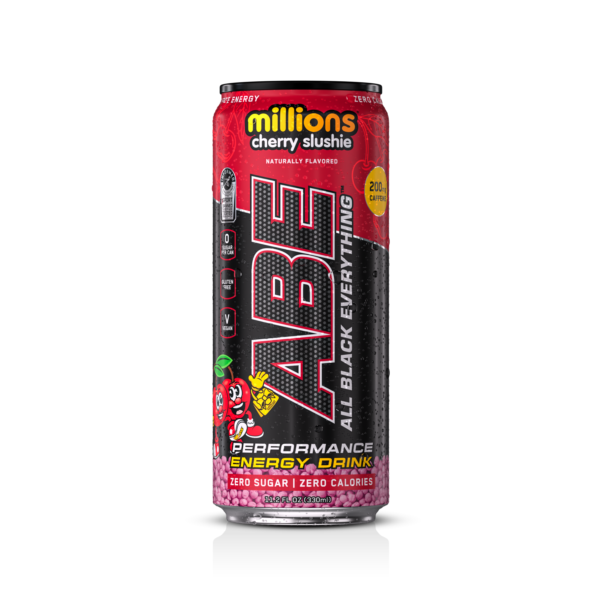
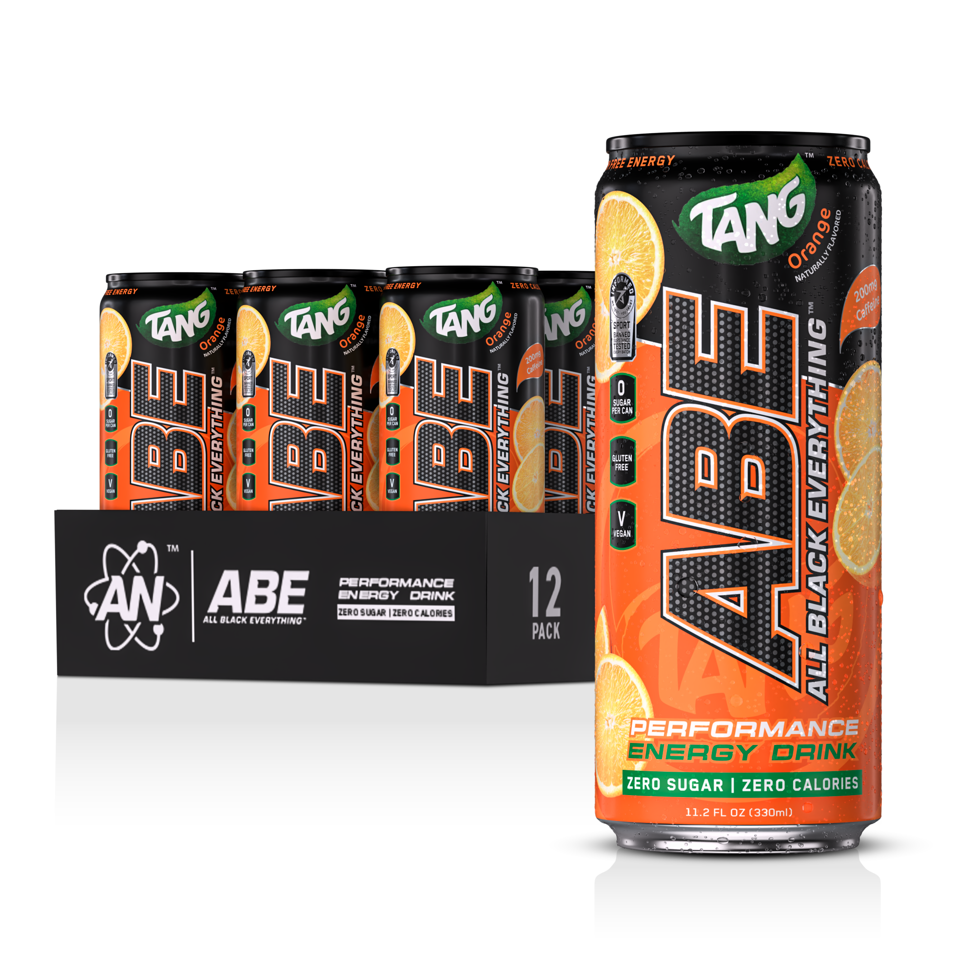
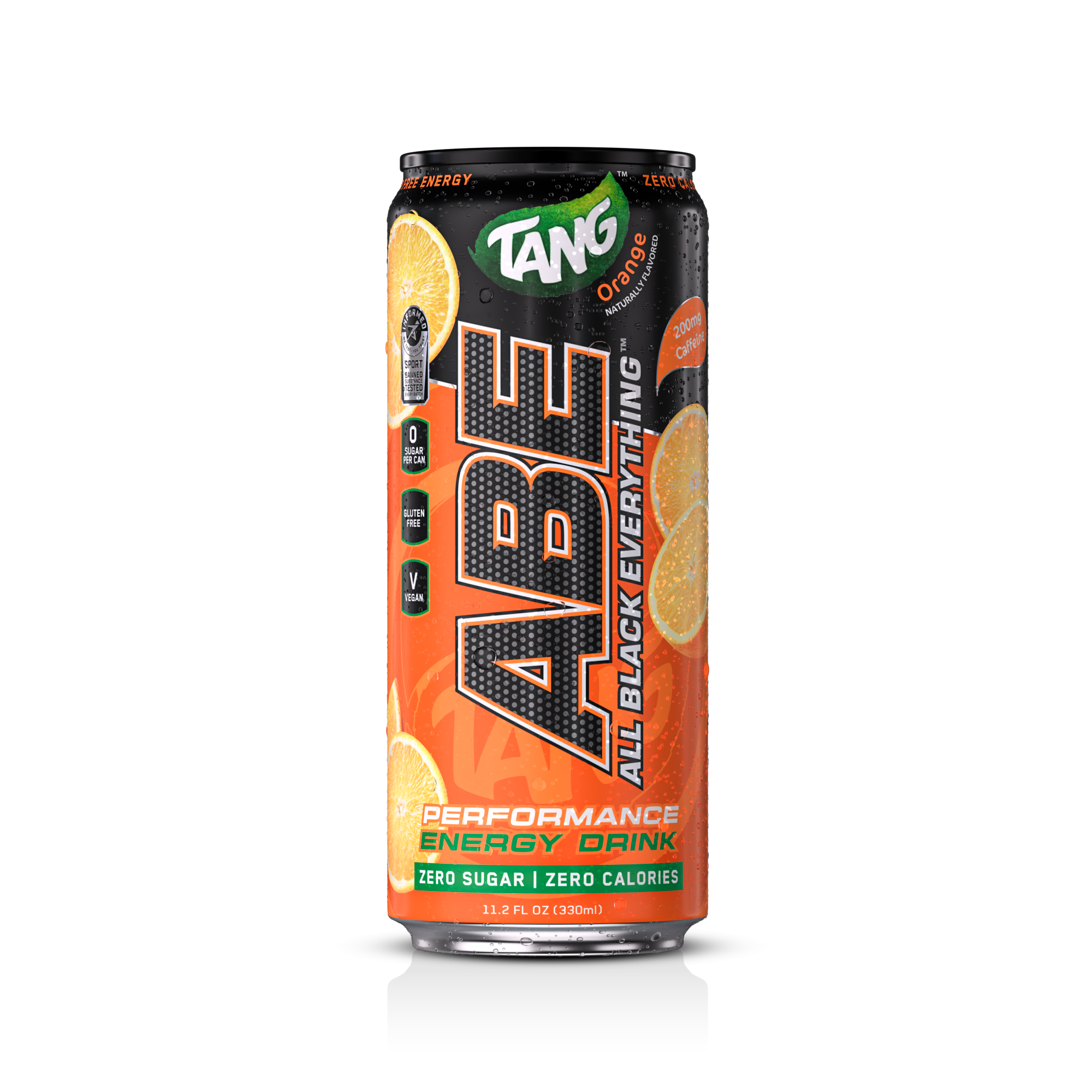
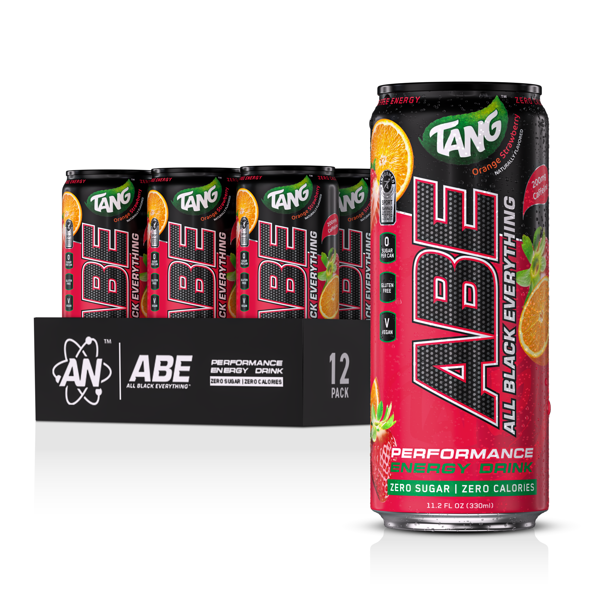
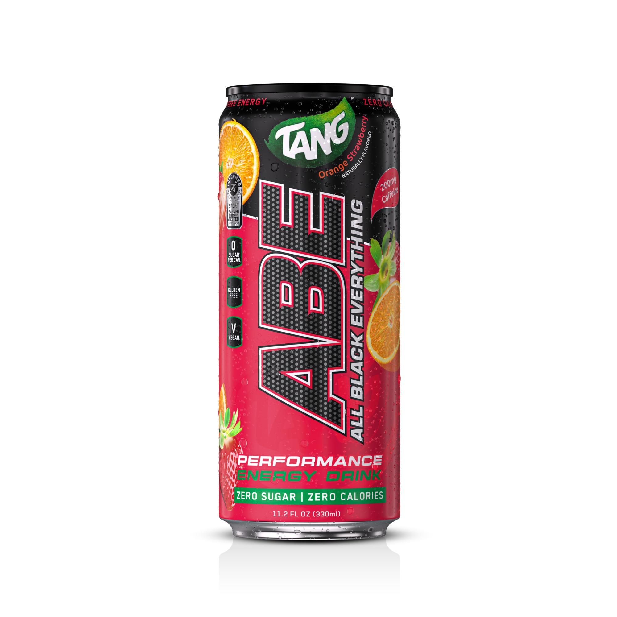
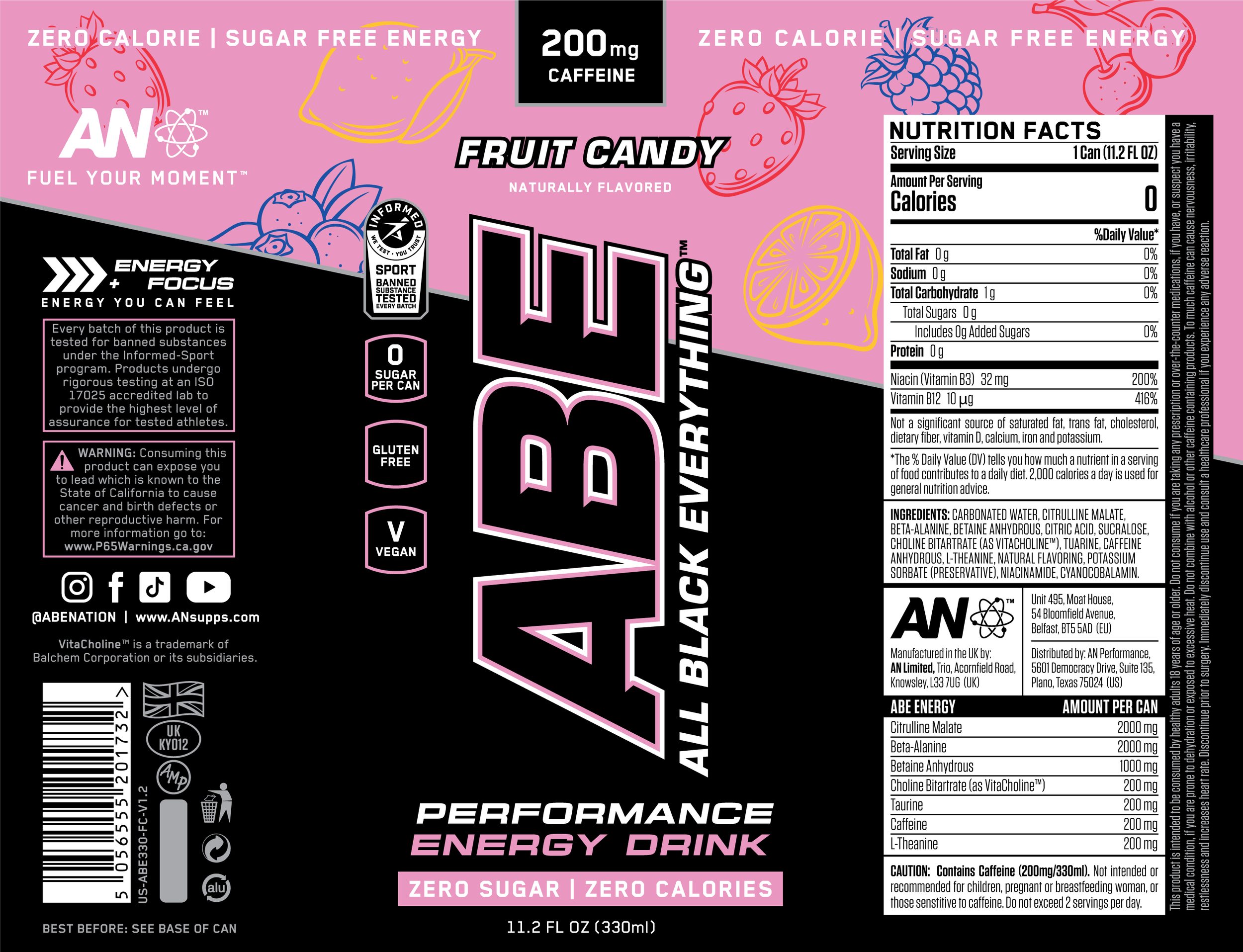
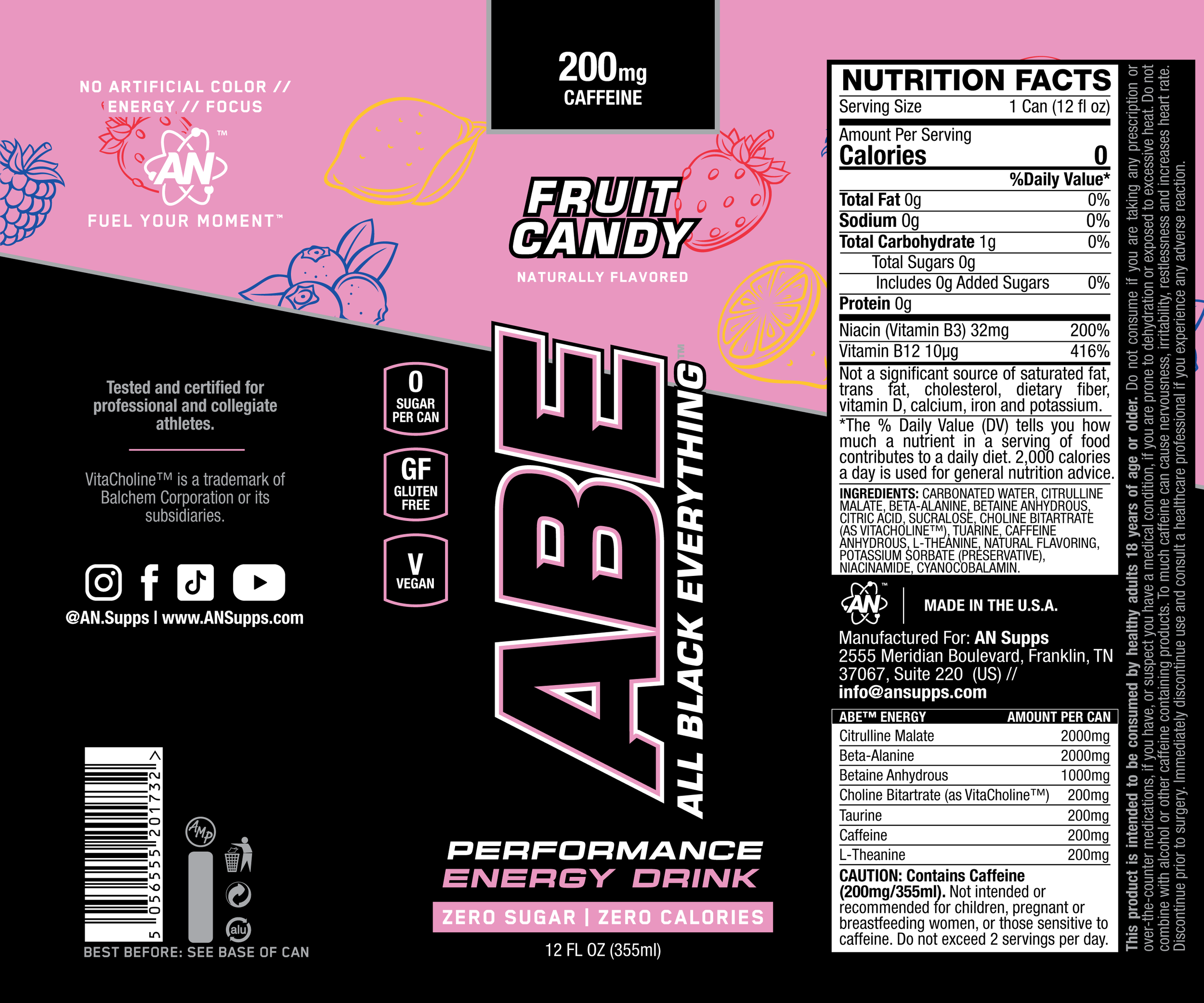
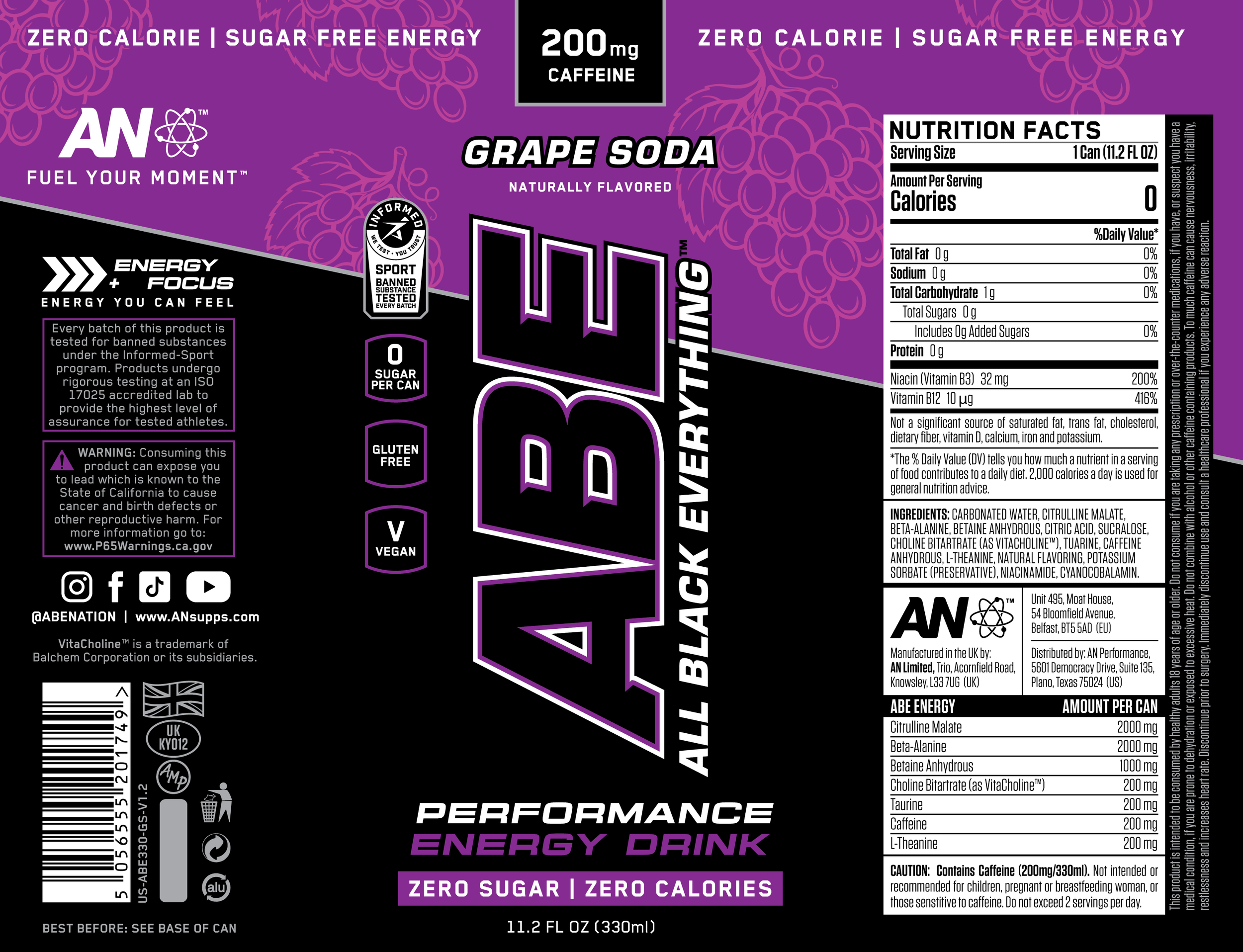
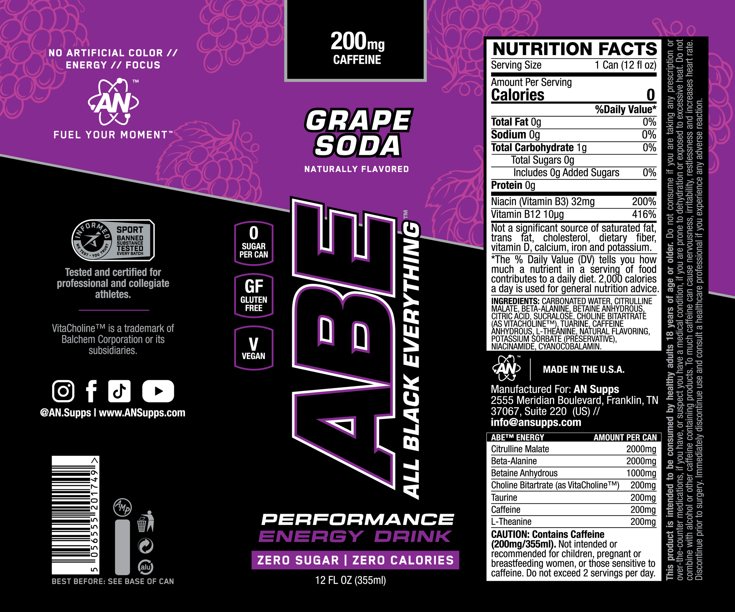
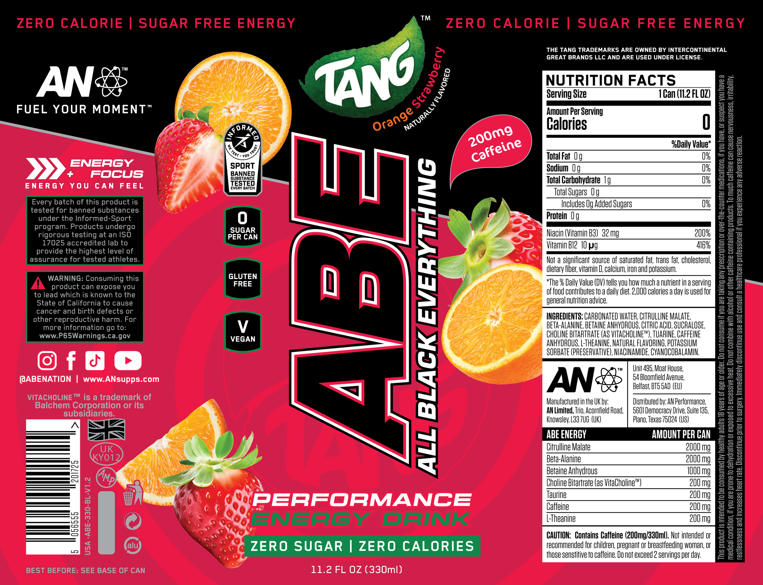
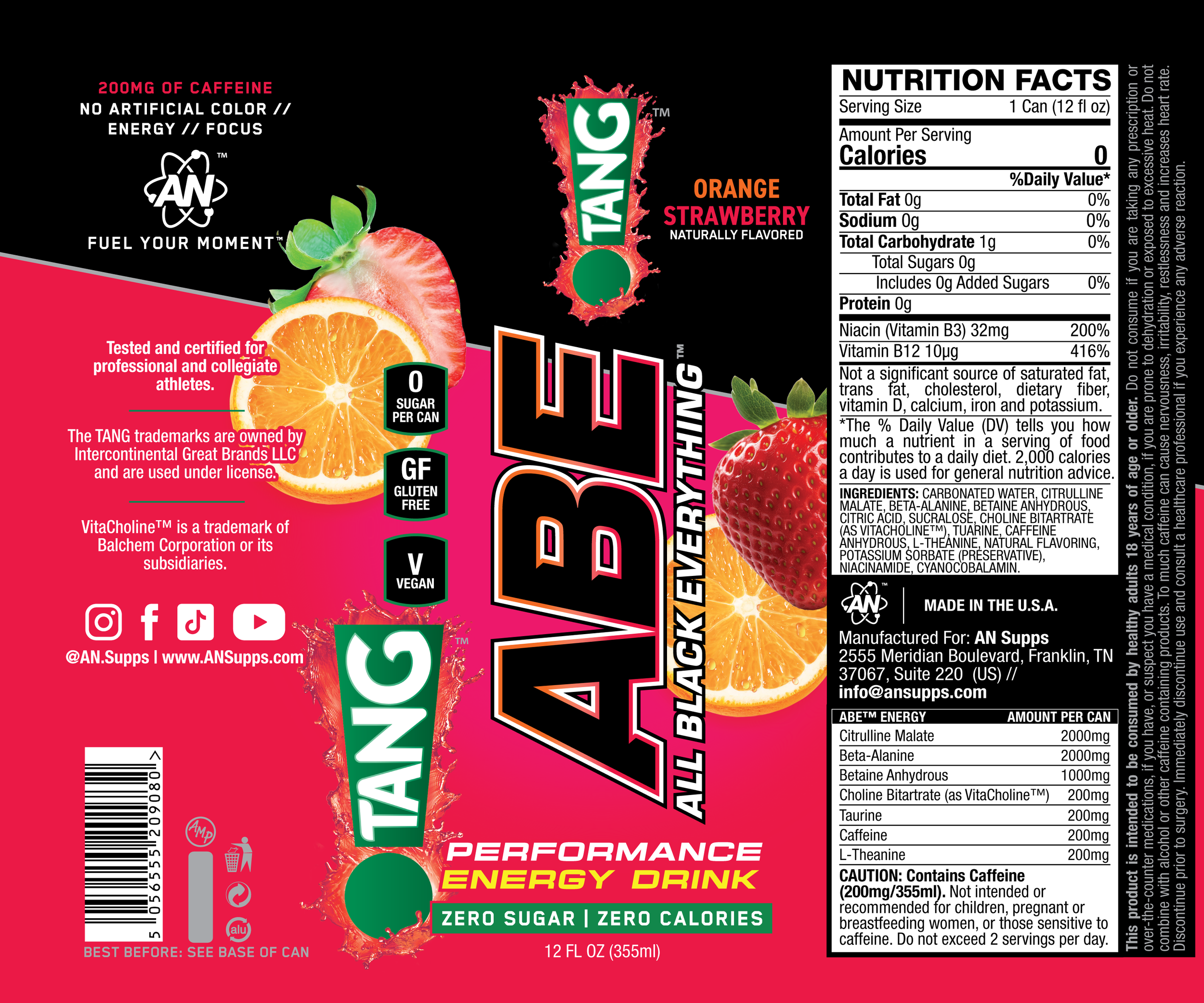
ABE’s legacy design was a fully blacked-out, 11.2 oz slim can and was highly recognized in the UK but presented limitations for U.S. consumers. The U.S. market favors more vibrant and informative designs, especially for functional beverages. The challenge was twofold: (1) bring in color and flavor cues without compromising the brand’s intense, high-performance identity, and (2) work within the constrained space of a smaller label to deliver visual clarity and shelf impact.
Solution
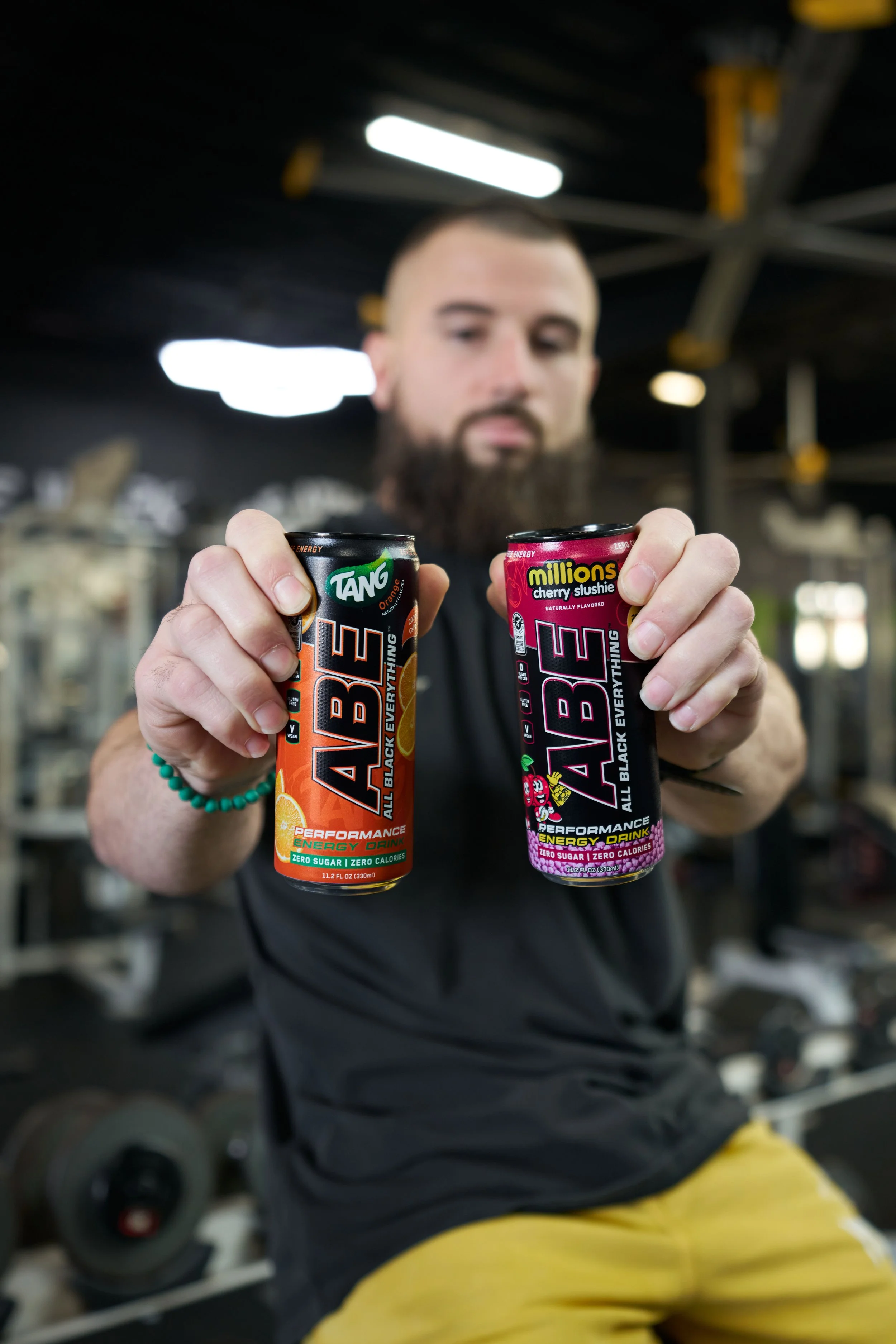
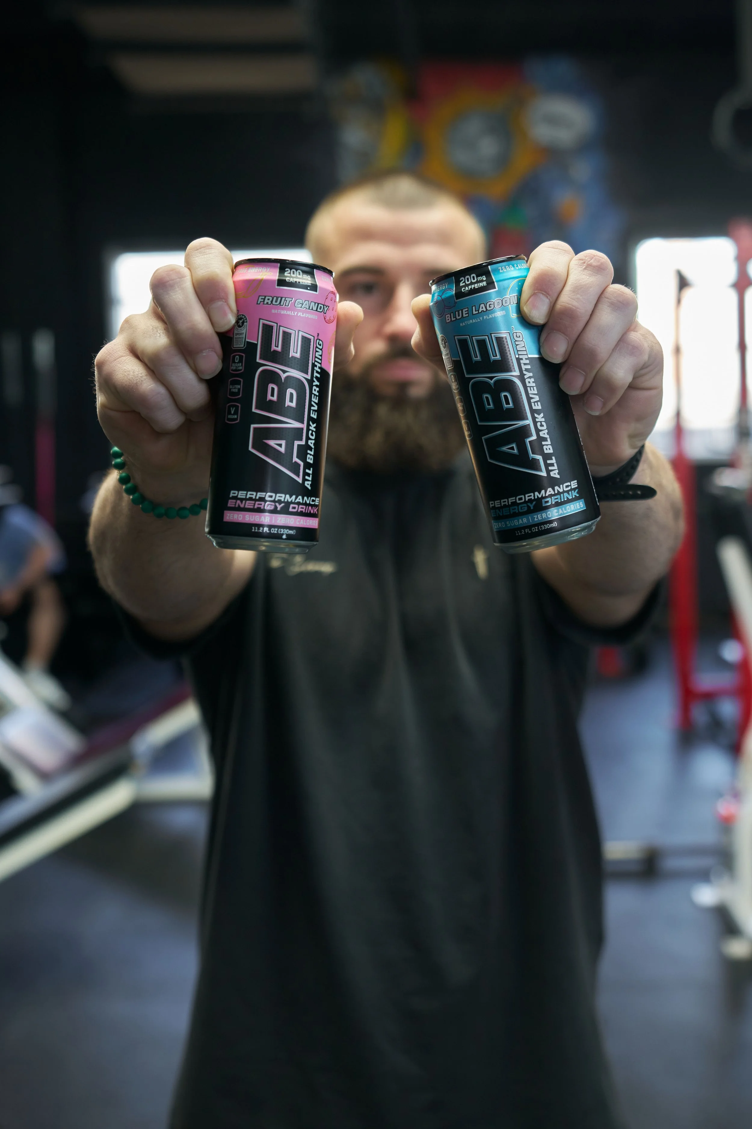
The final design effectively bridged legacy branding with modern appeal, establishing a clear visual language that supports future flavor licensing opportunities. The new look stands out on U.S. shelves, communicates flavor at a glance, and positions ABE as a serious player in the functional beverage space globally.


Packaging
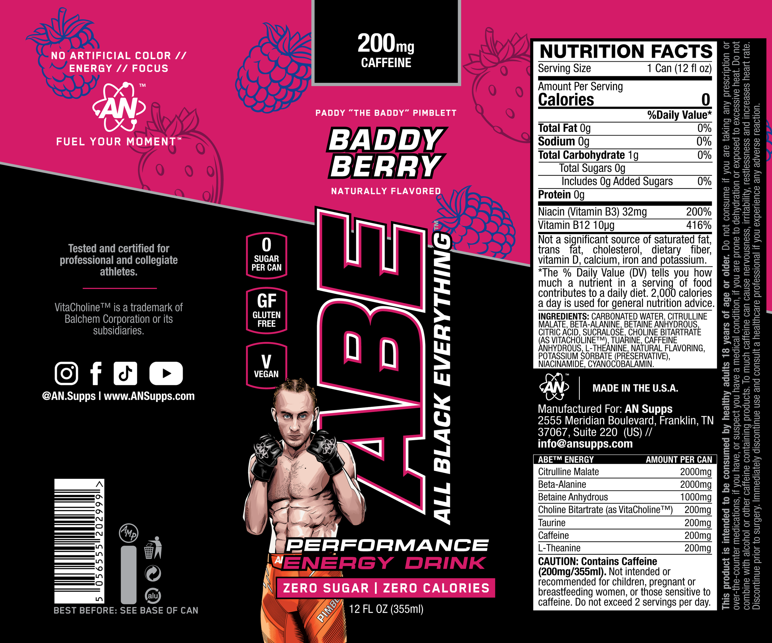
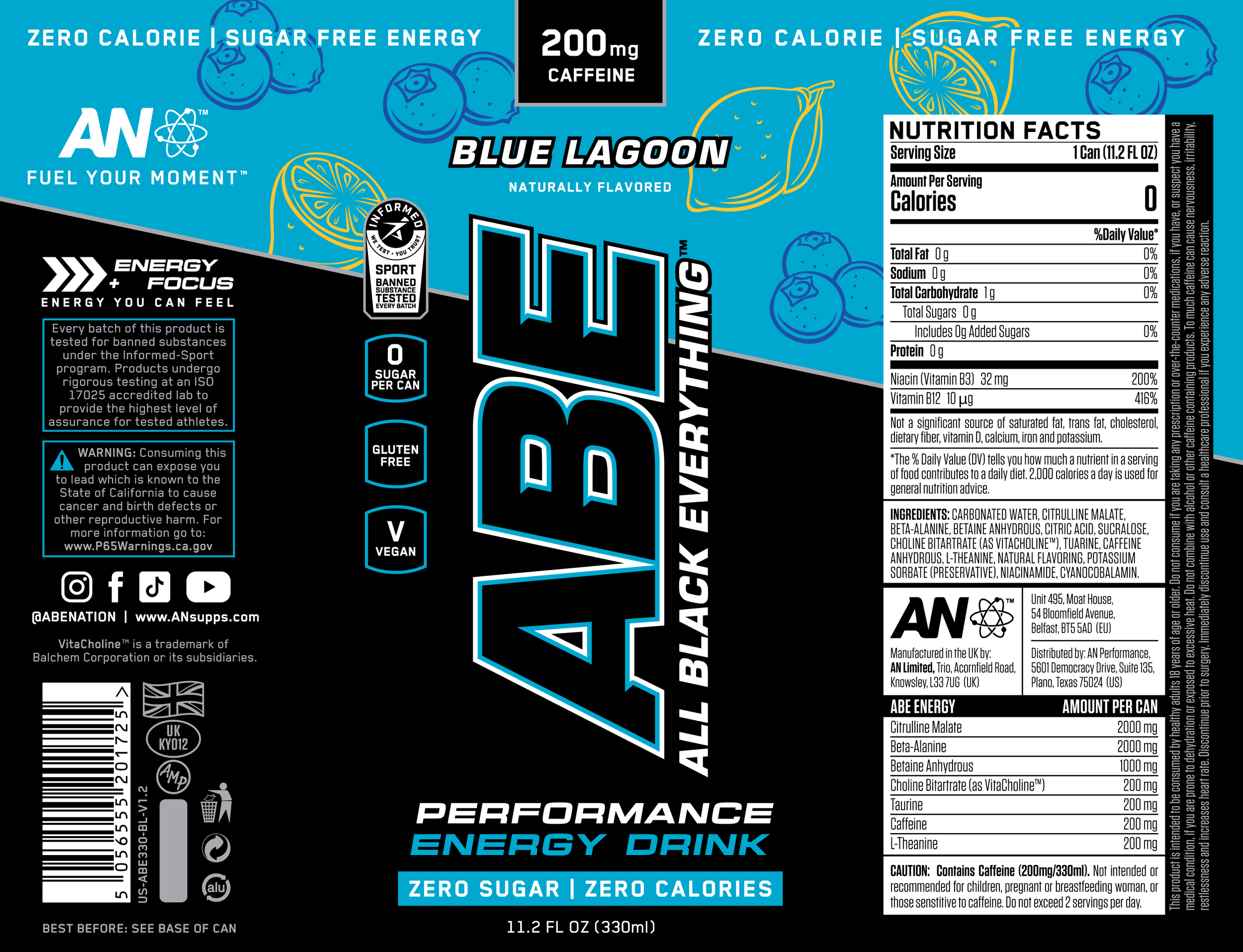
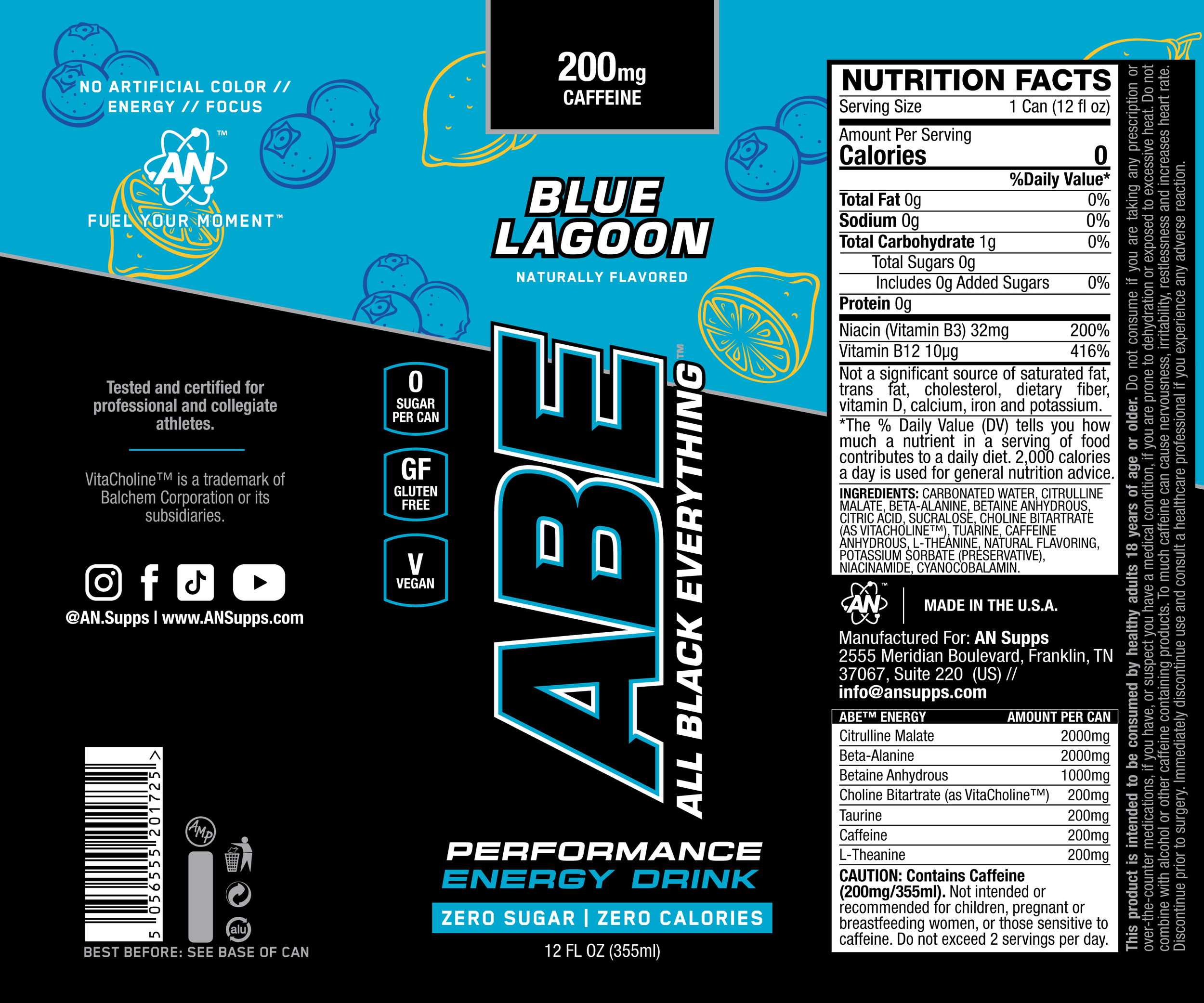
(v1) 11.2 oz UK cans | (v2) 12 oz USA cans
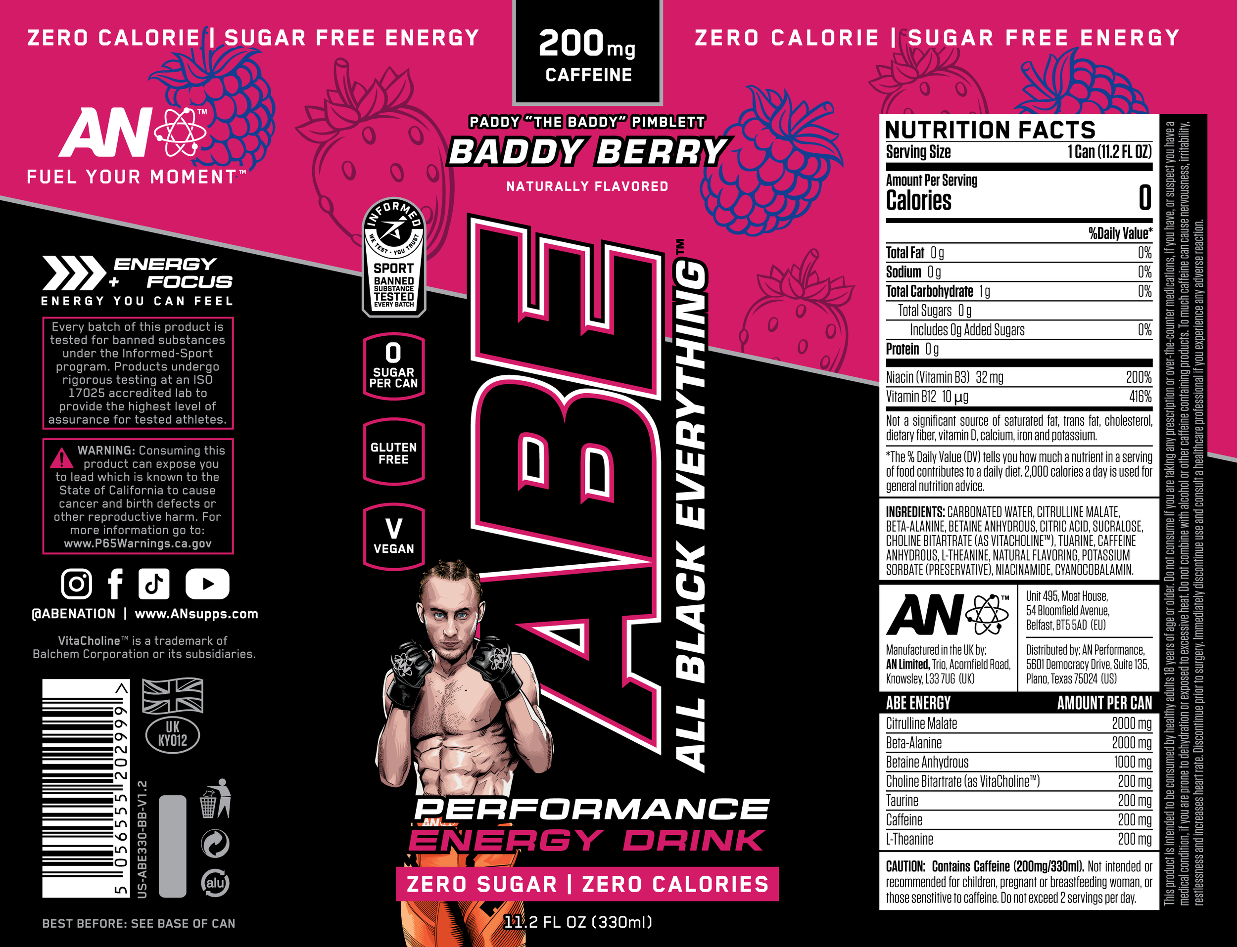
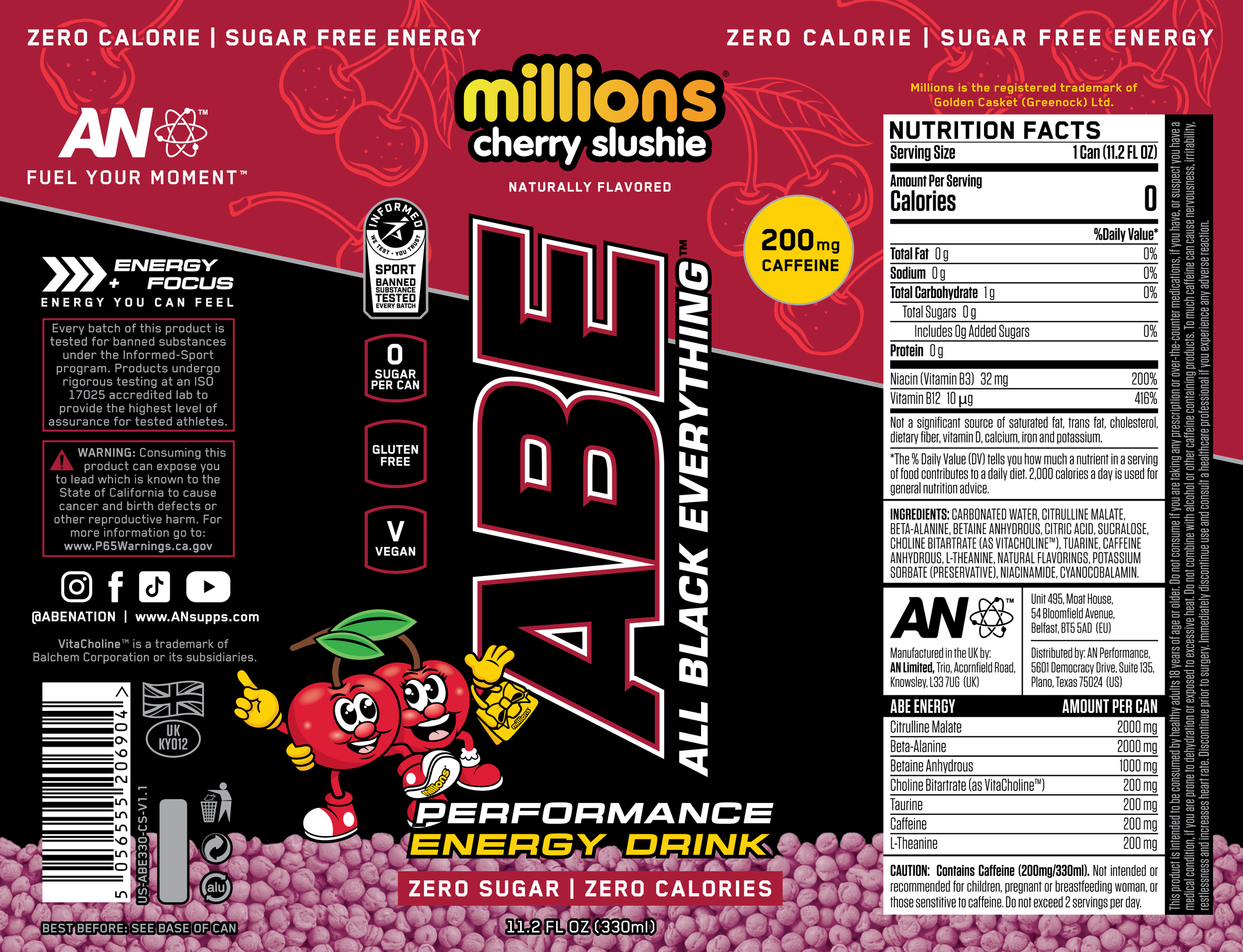
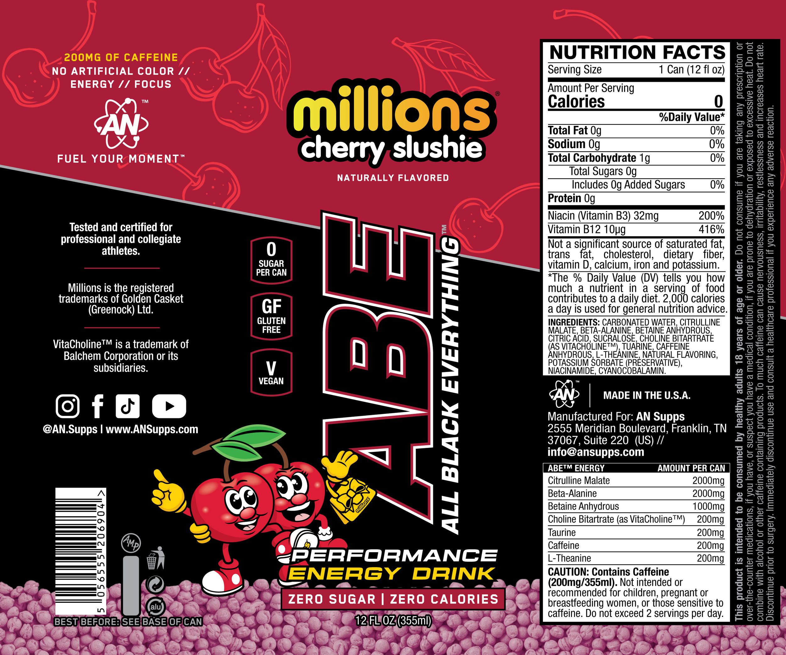
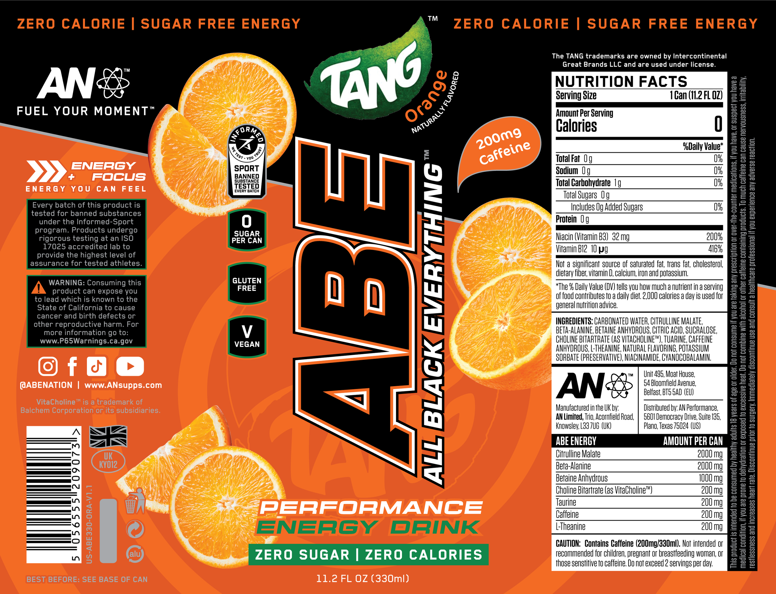
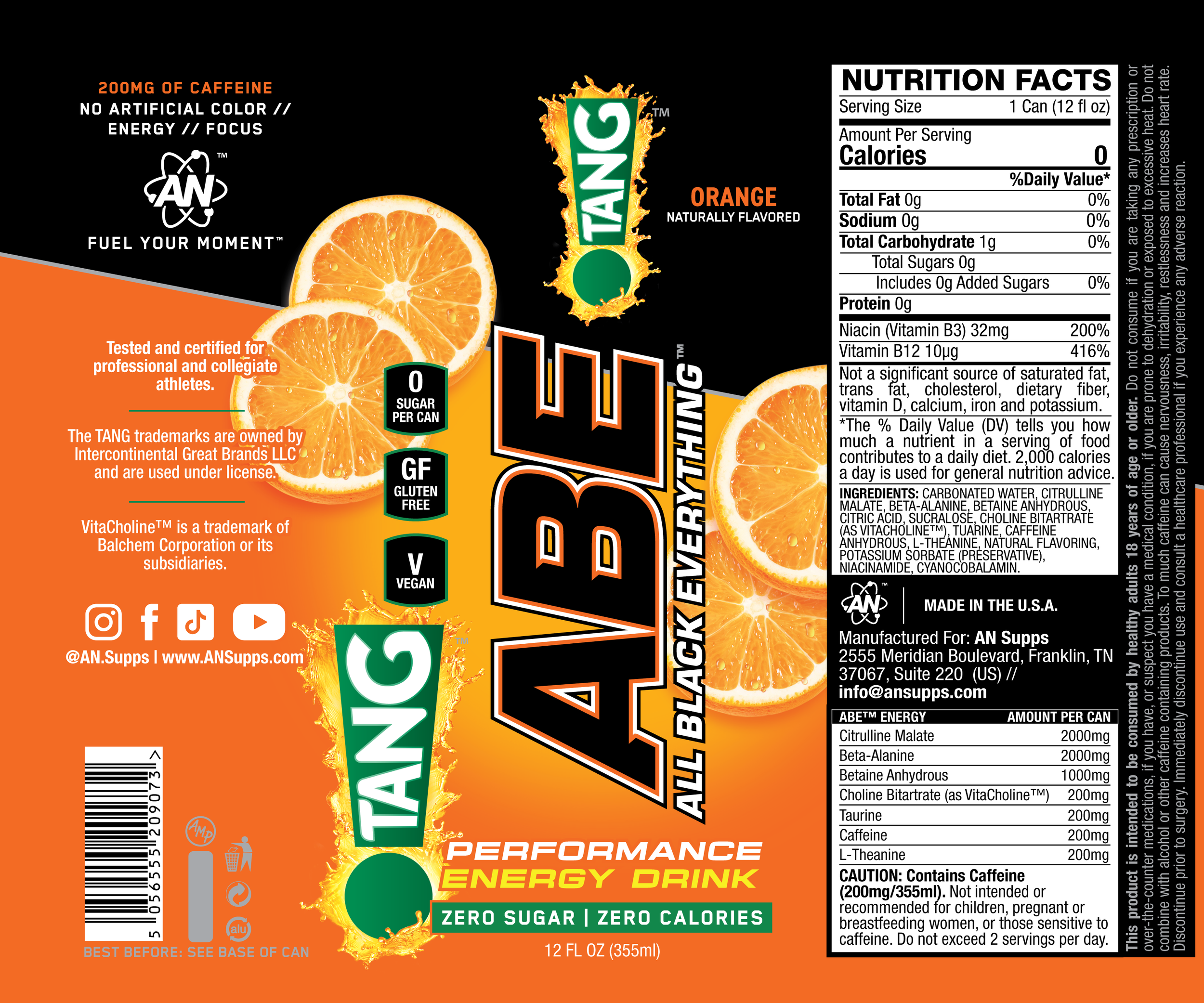
ABE™ Energy’s Original Look
ABE’s original design featured a bold, all-black aesthetic with minimal use of color—typically a colored outline around the logo lock-up and a subtle brand pattern printed directly onto the can. This stripped-back look emphasized intensity and performance, aligning with the product’s hardcore positioning. The printed pattern added a tactile, premium touch while reinforcing brand identity without relying on loud graphics or traditional flavor cues.

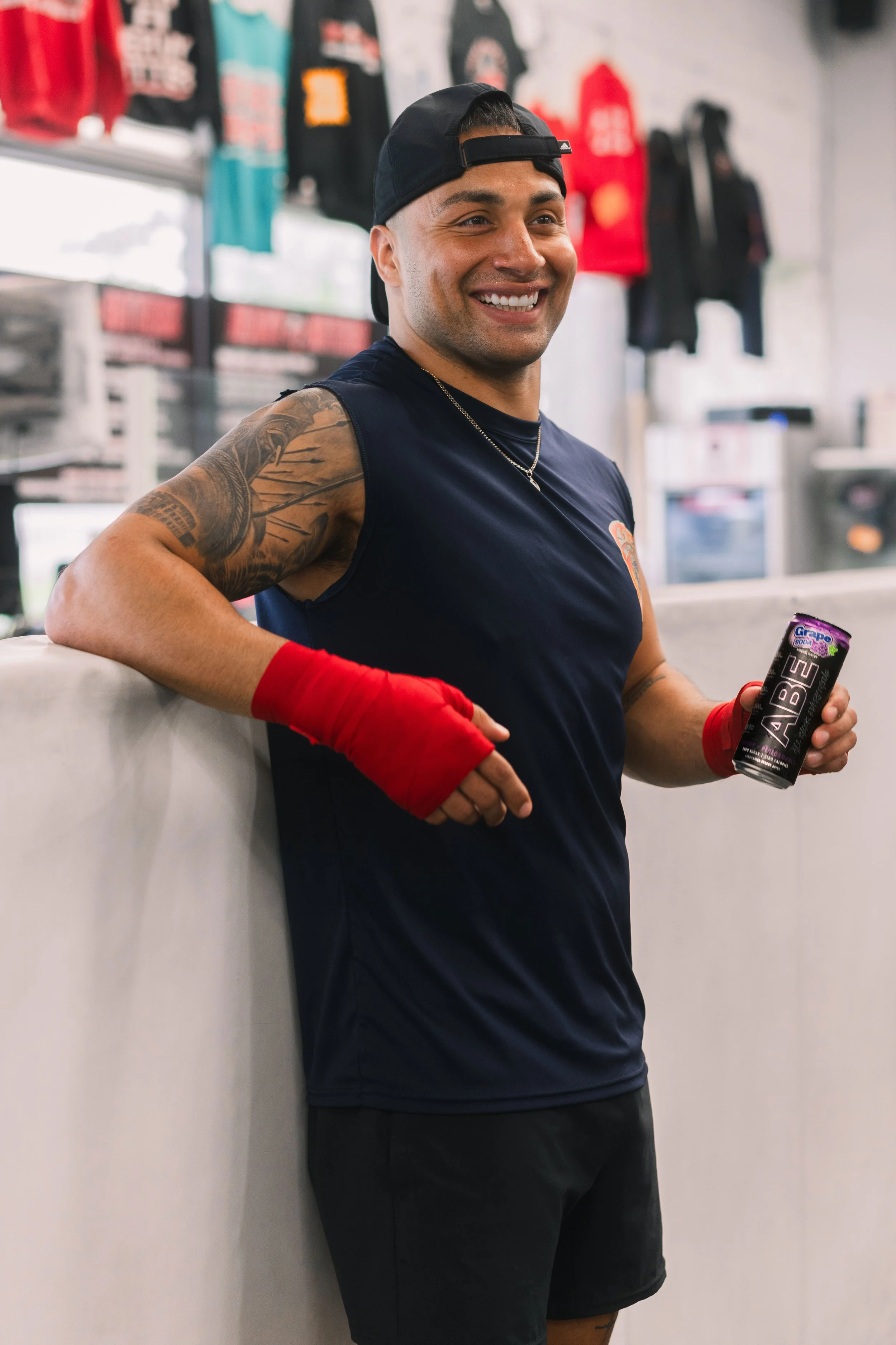
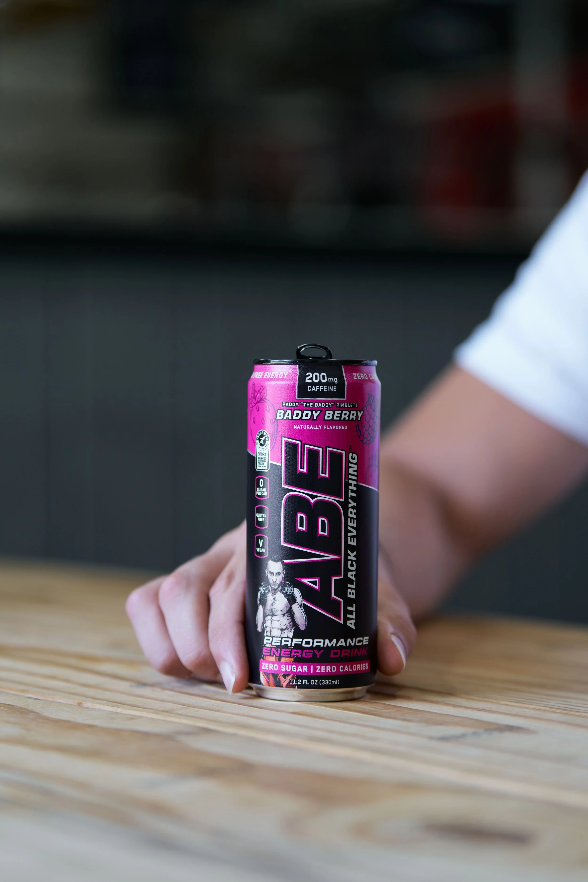
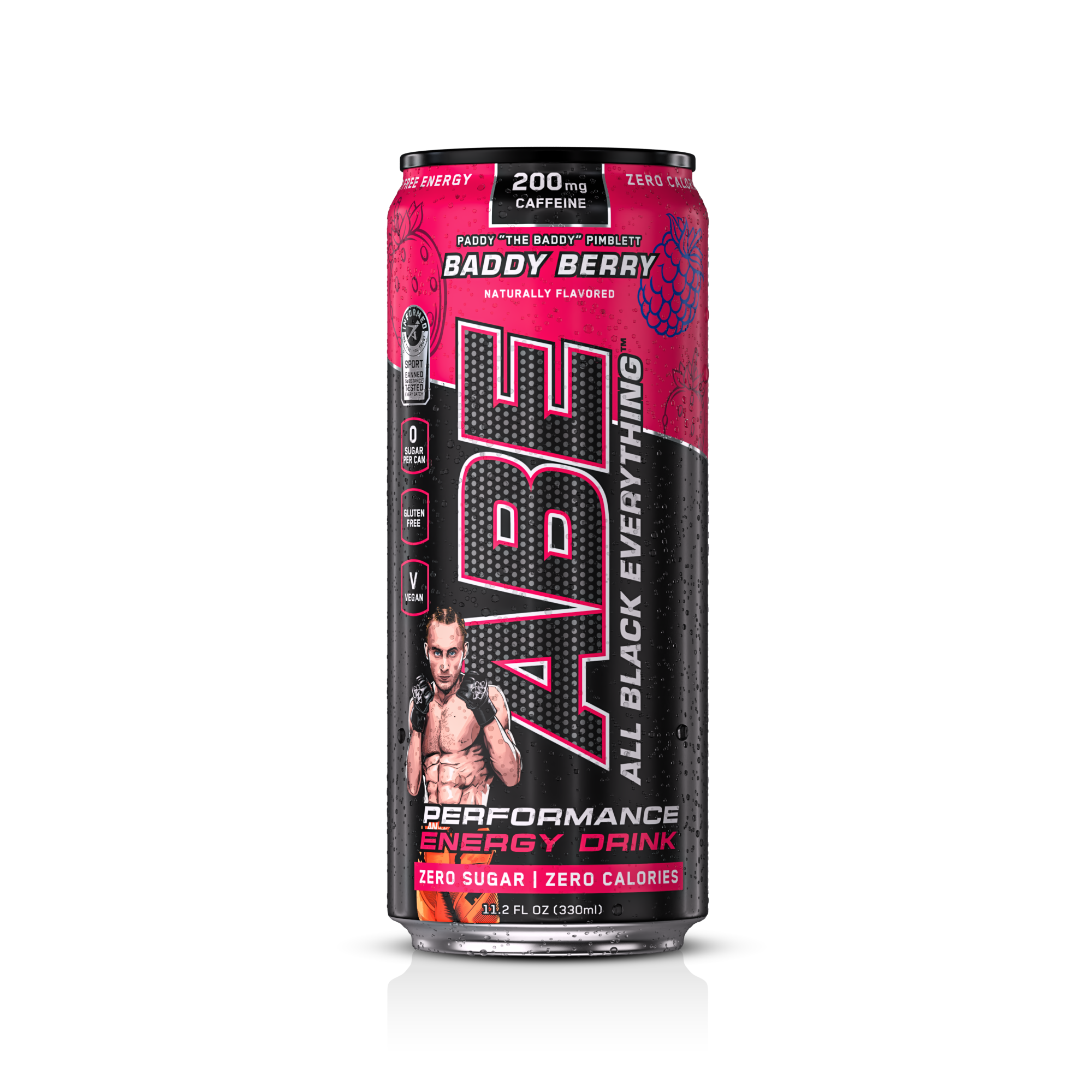
The Baddy
UFC Lightweight fighter, Paddy “The Baddy” Pimblett holding his *NEW LOOK* signature flavor “Baddy Berry”.