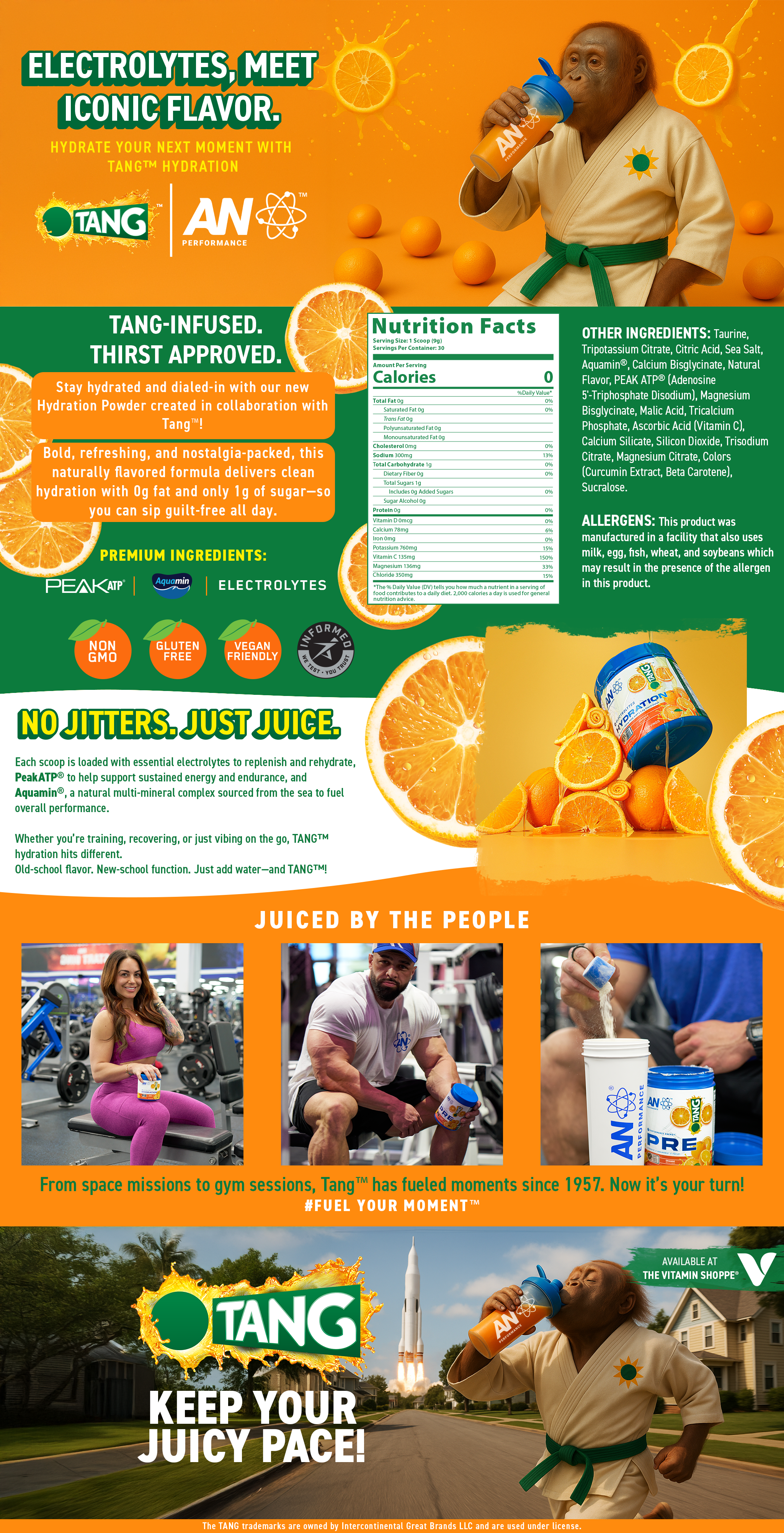
Project
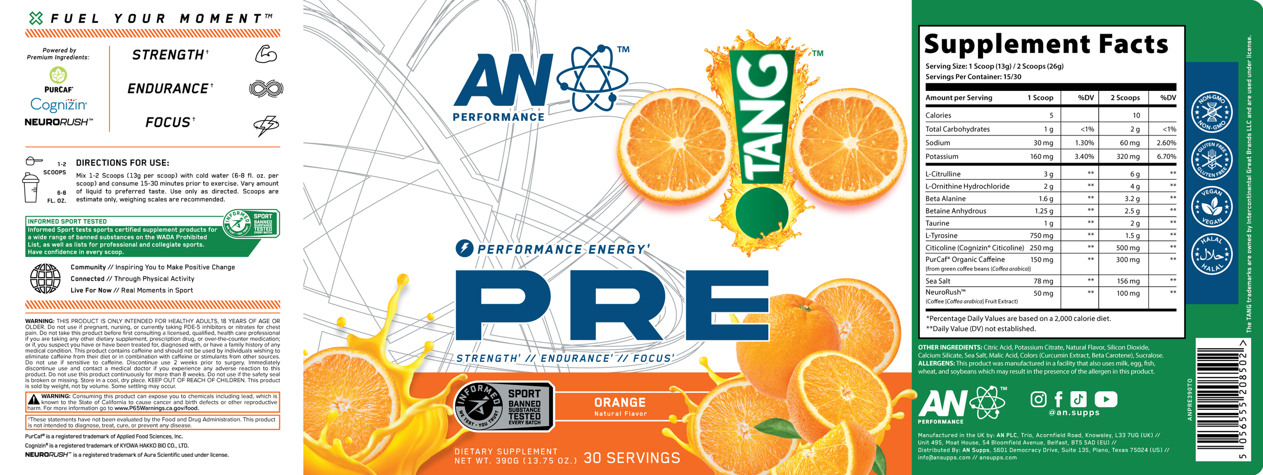
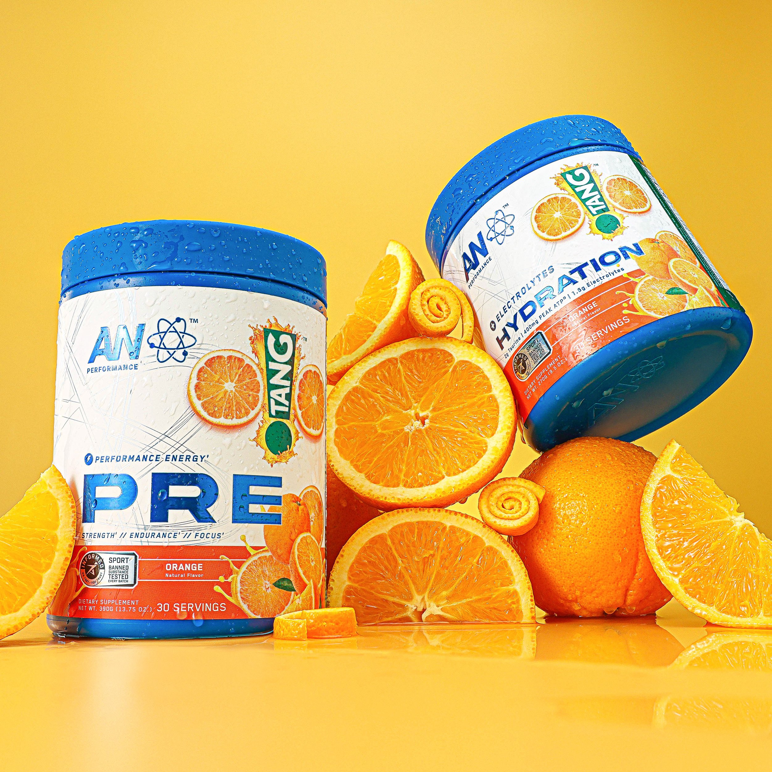
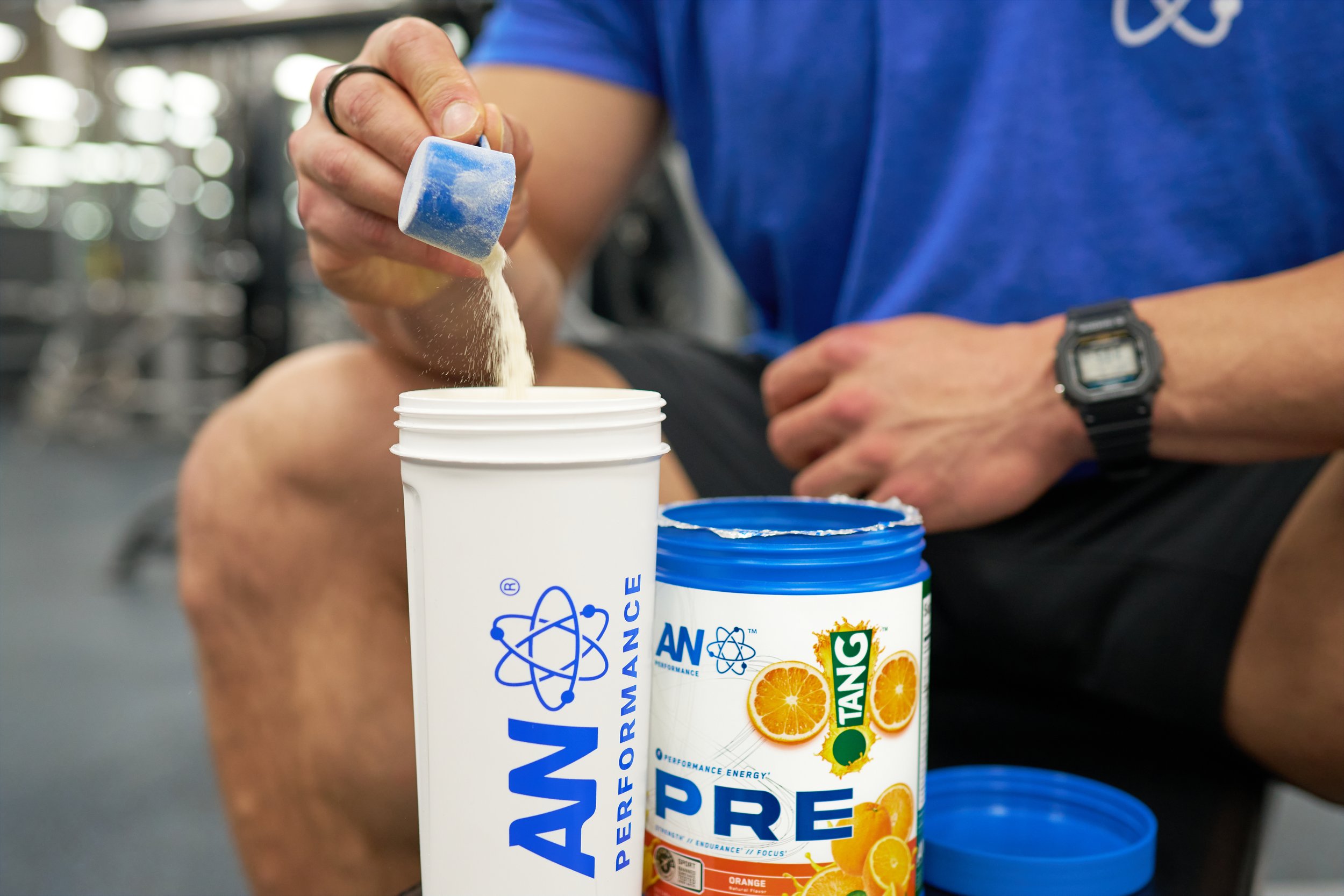
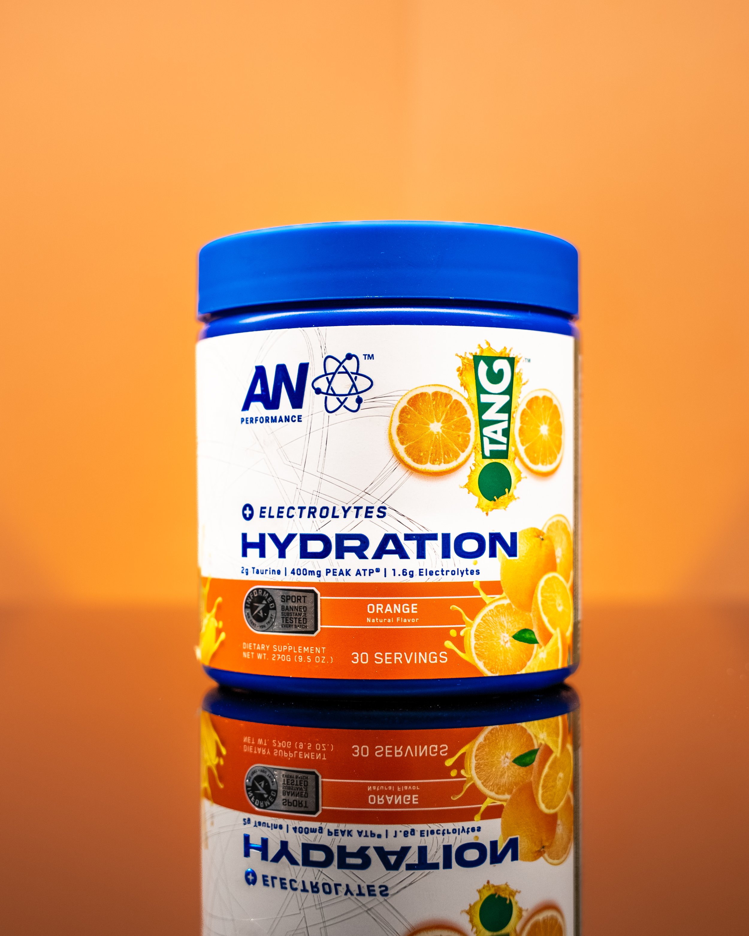
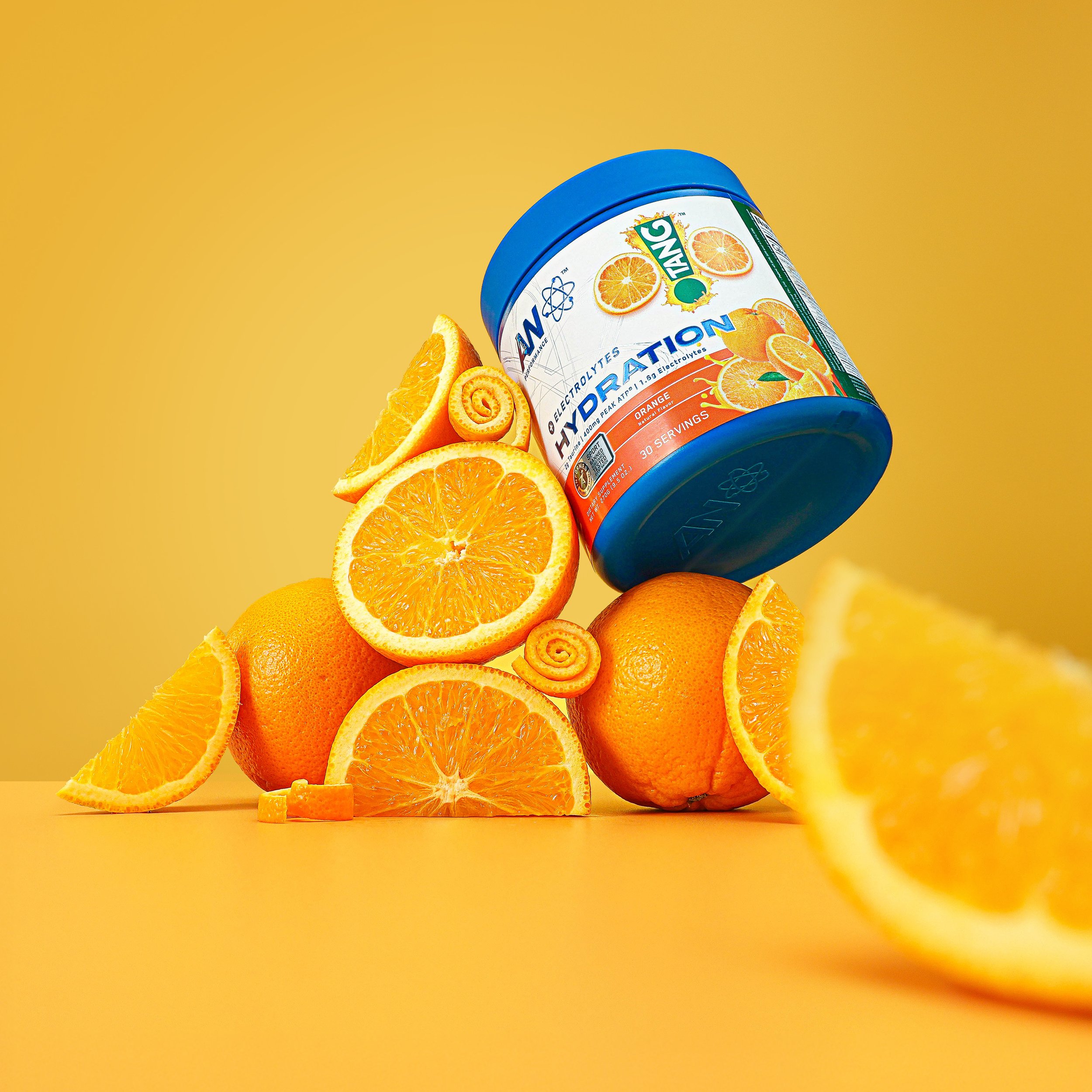
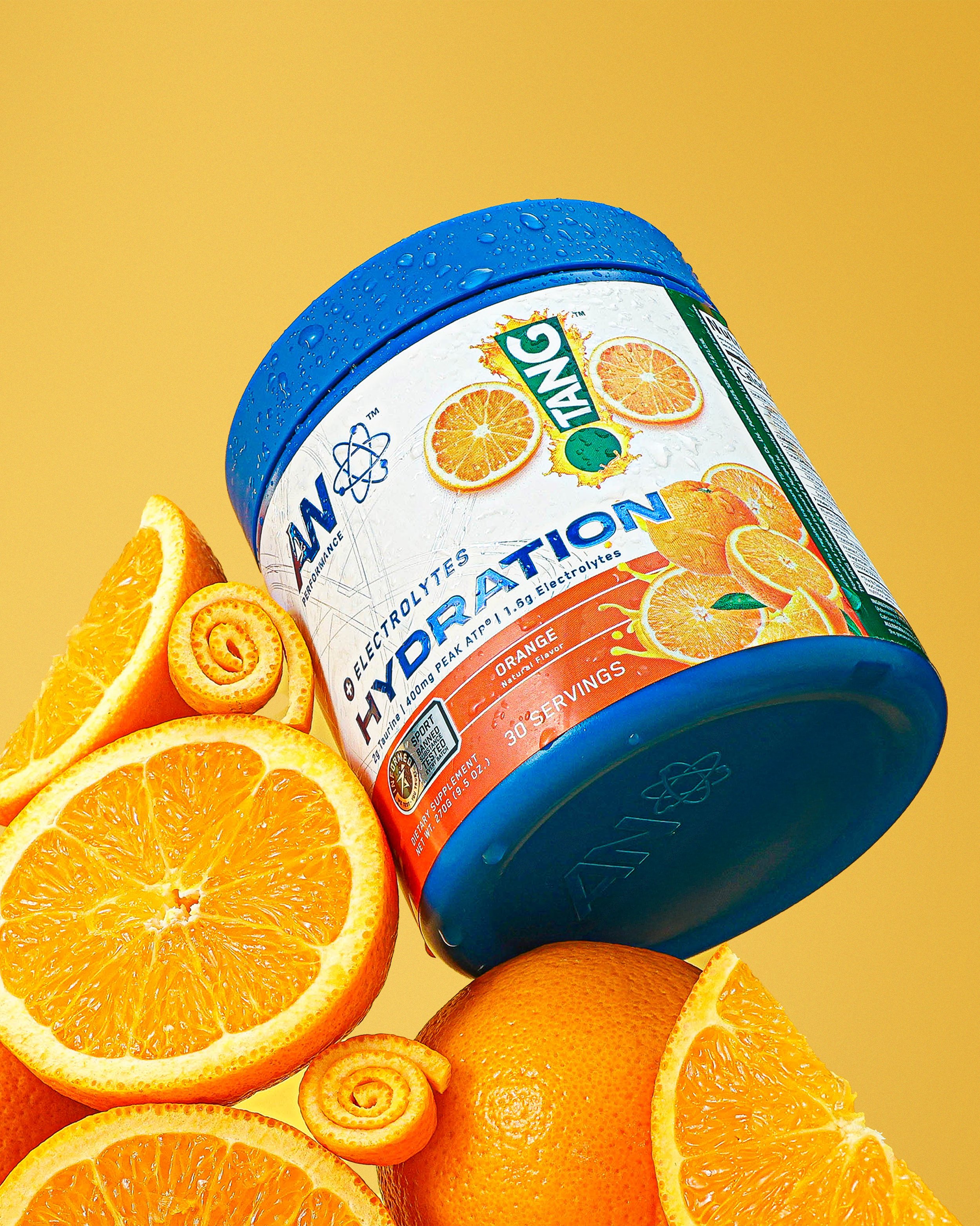
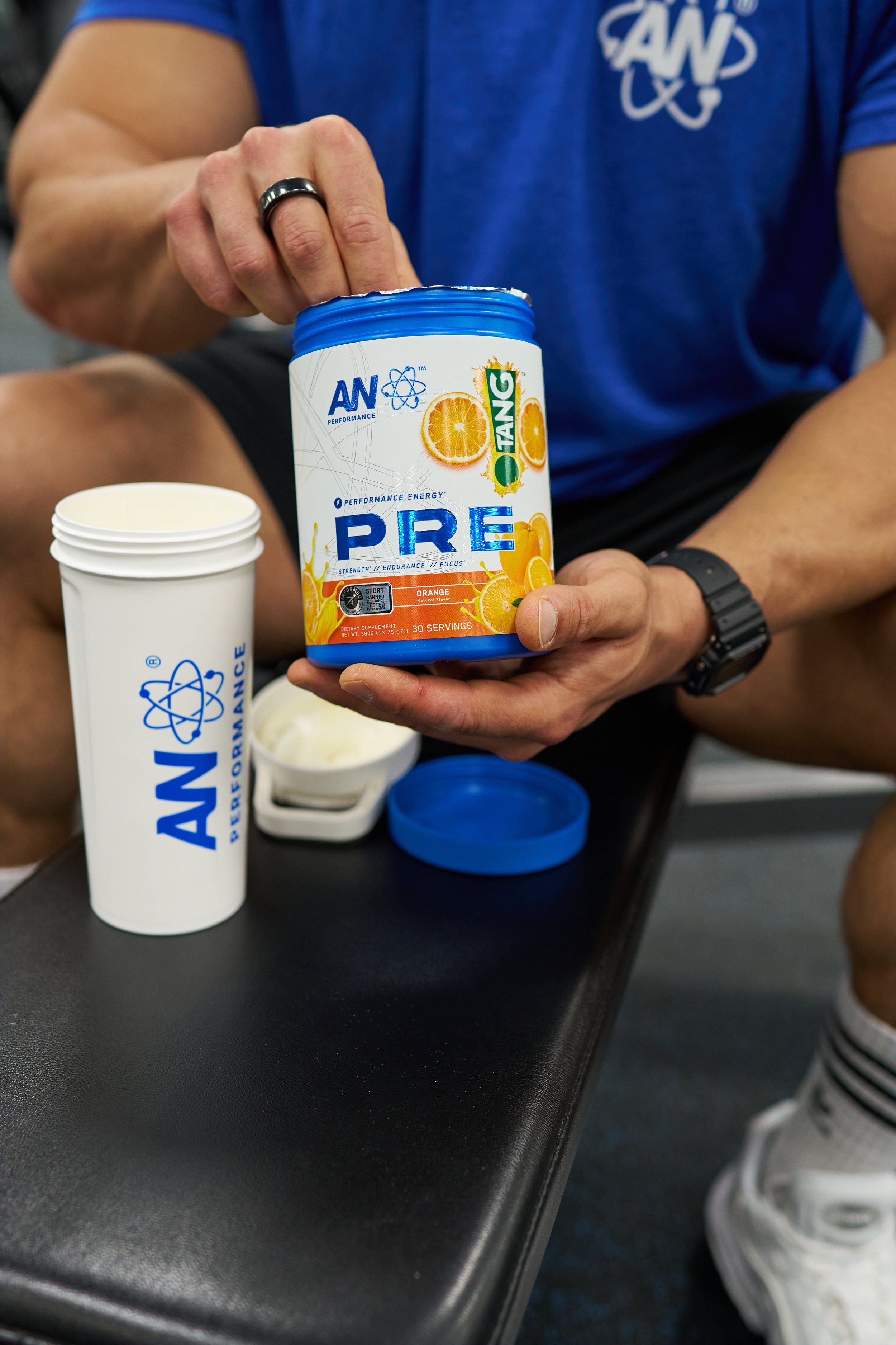
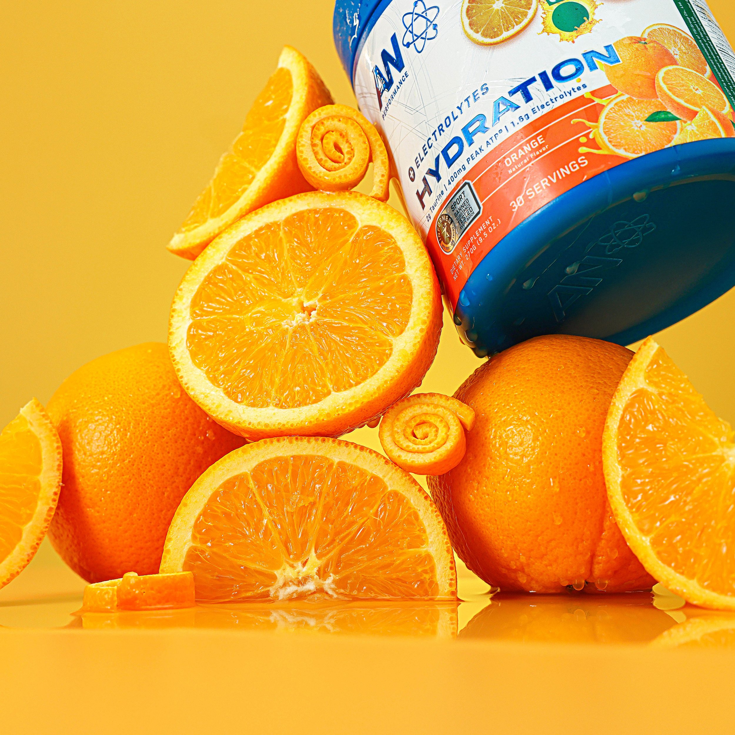
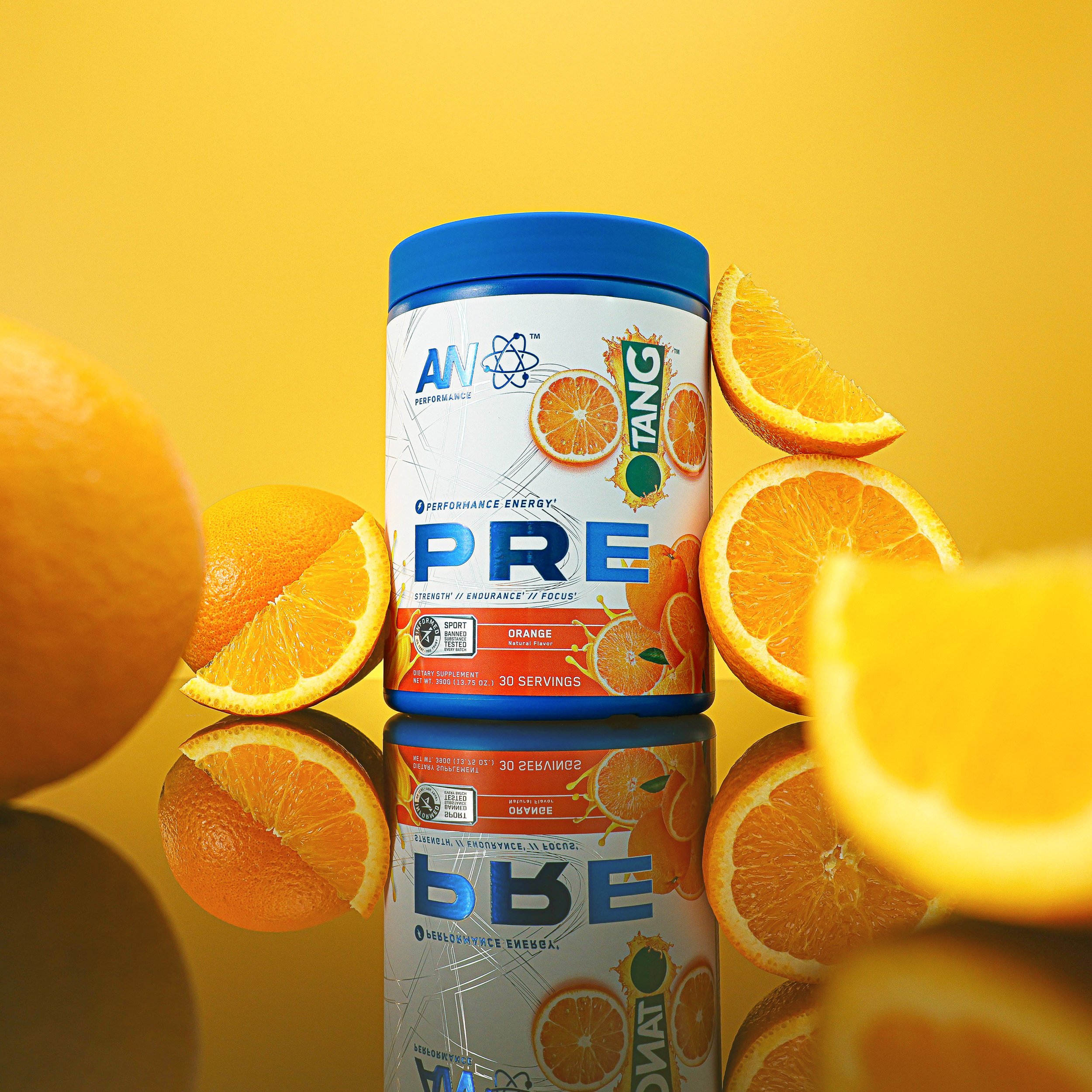
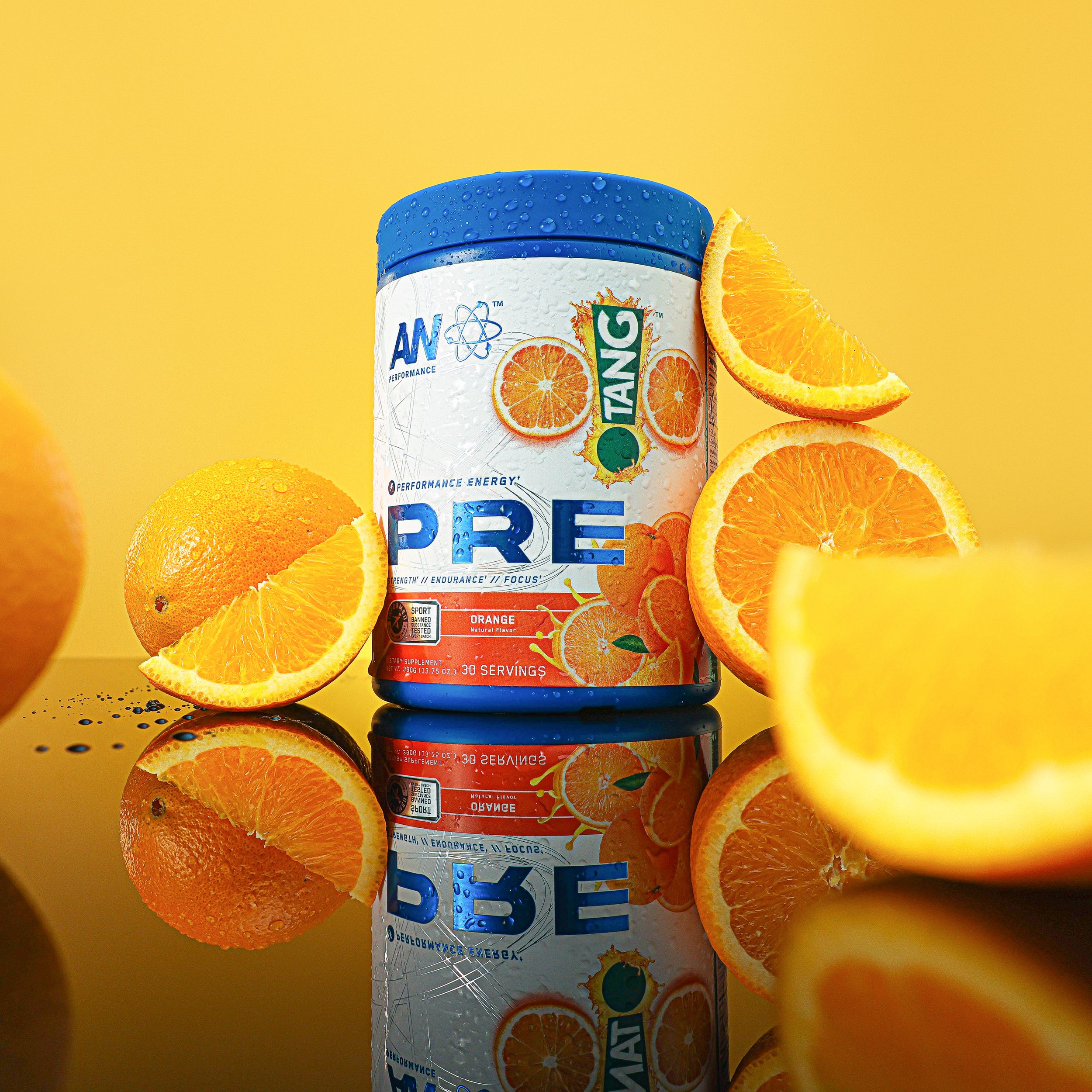
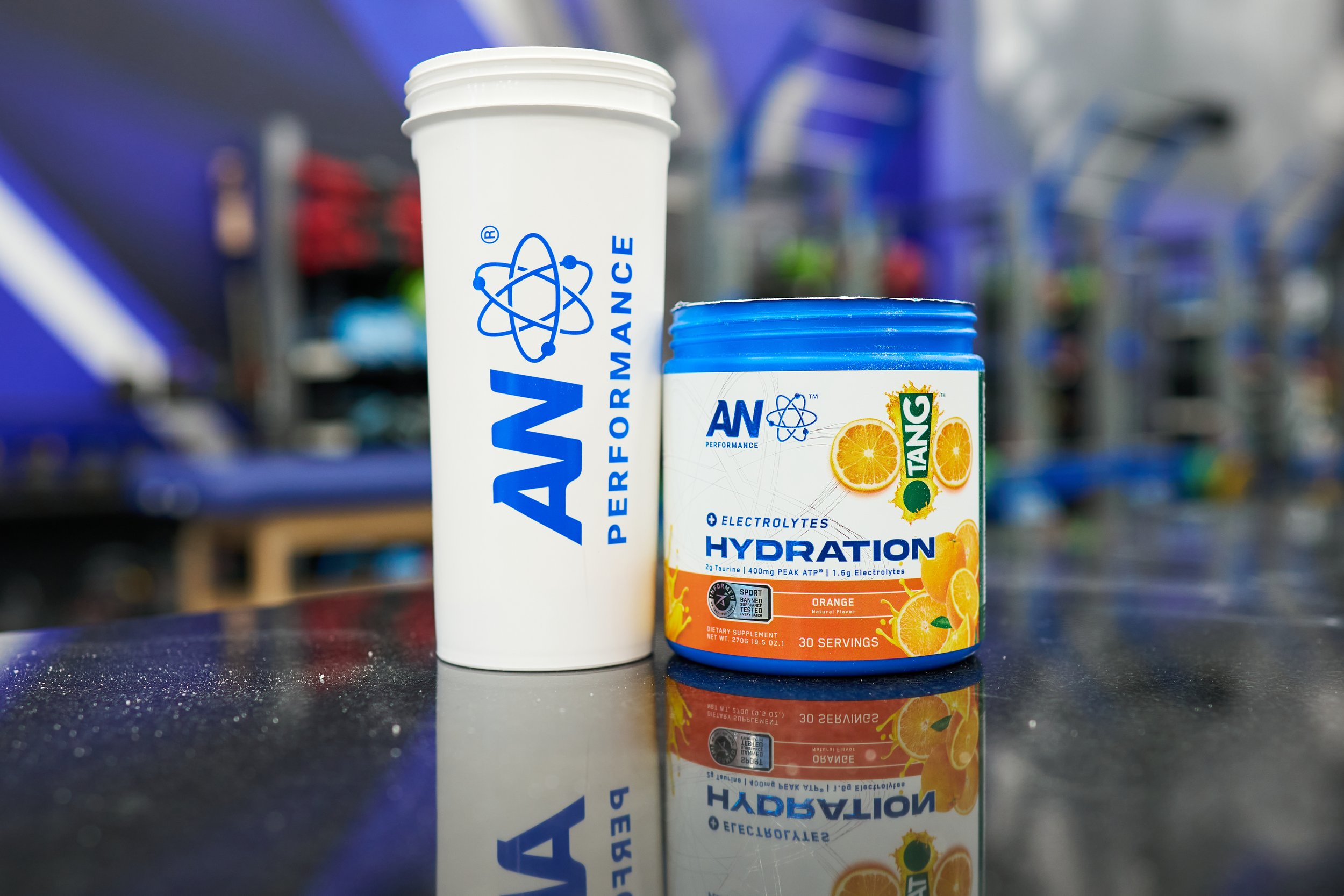
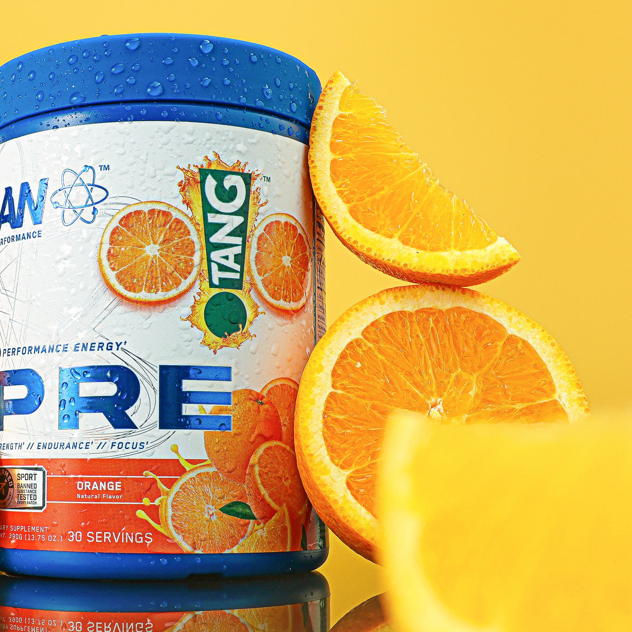
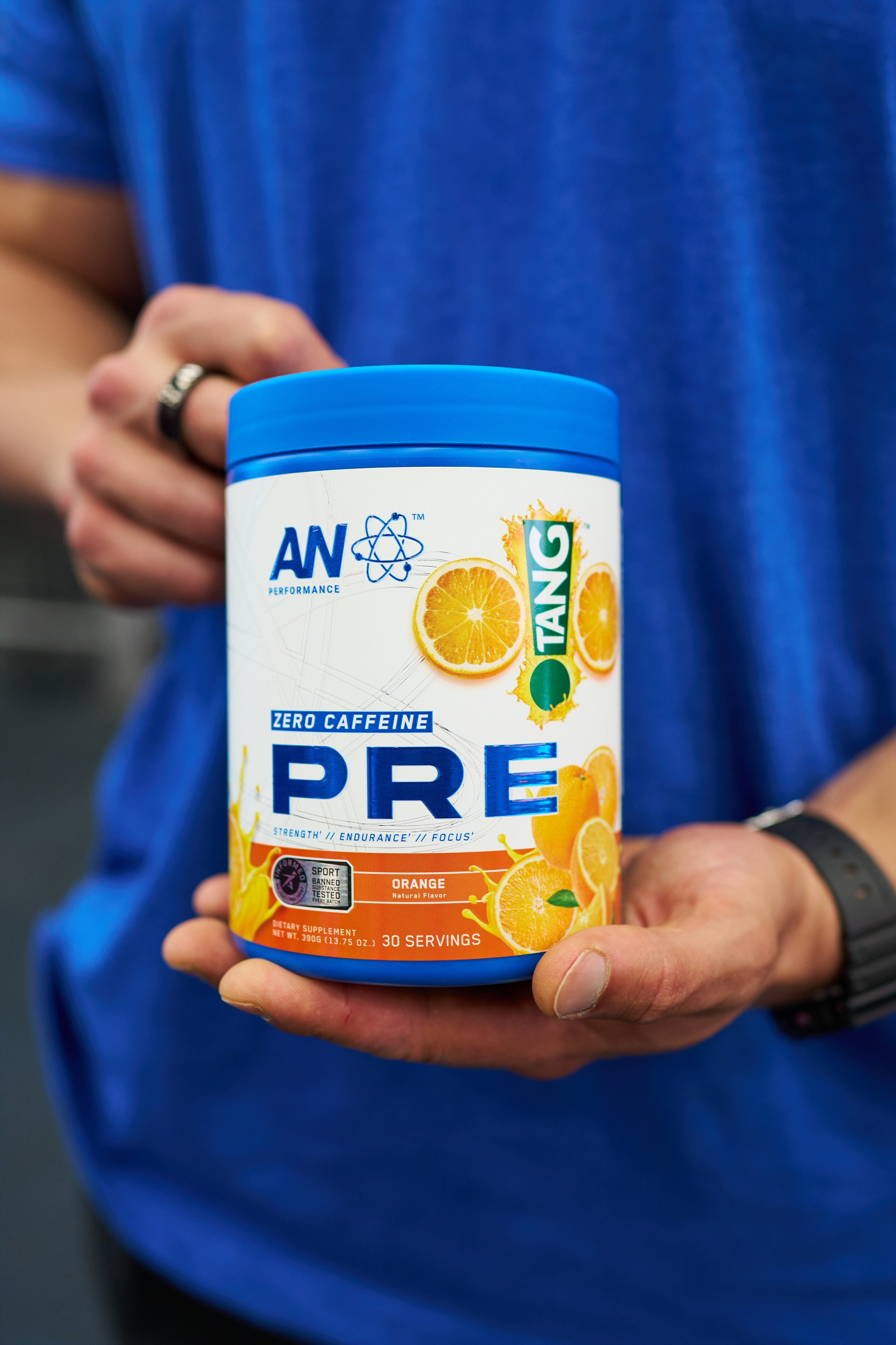
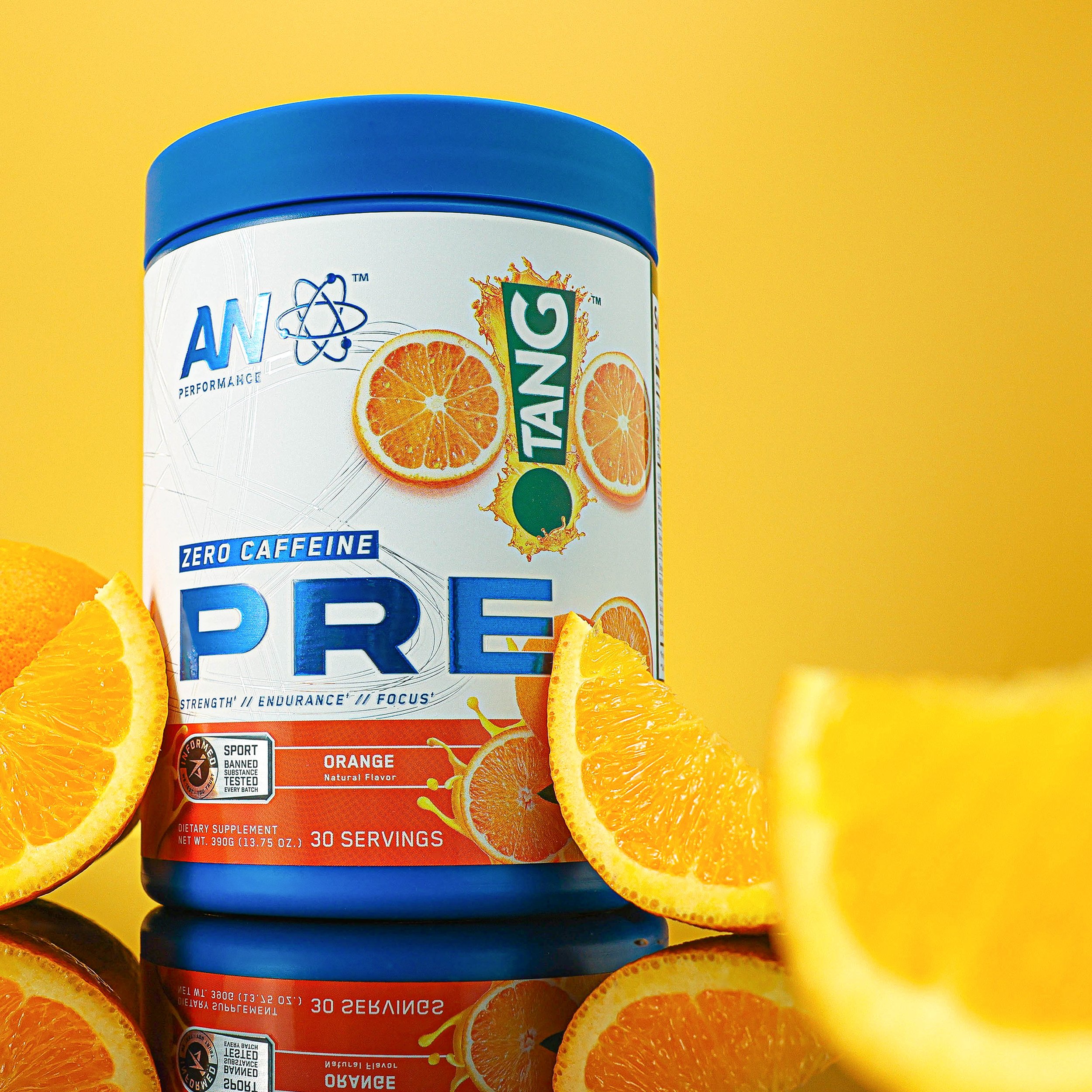
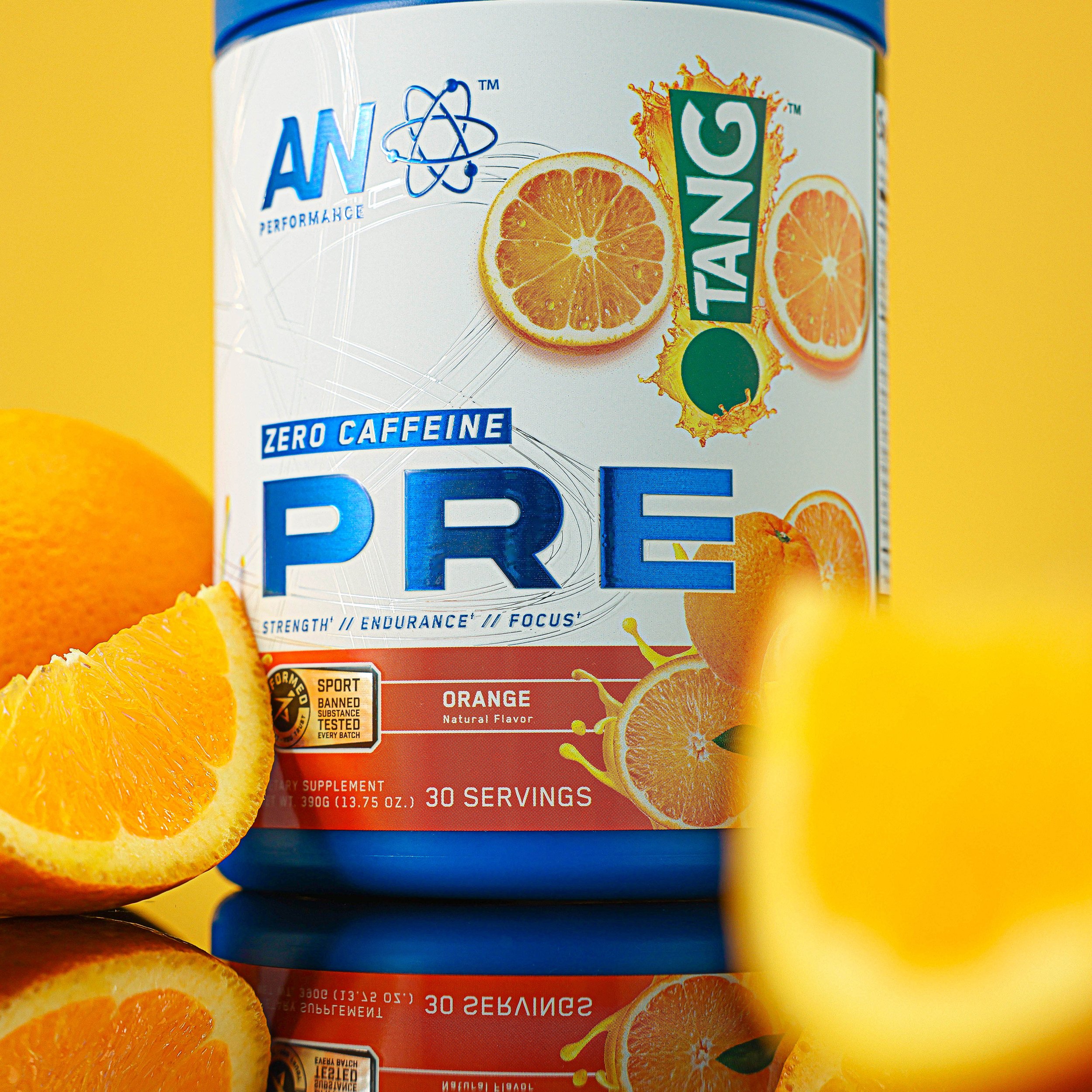
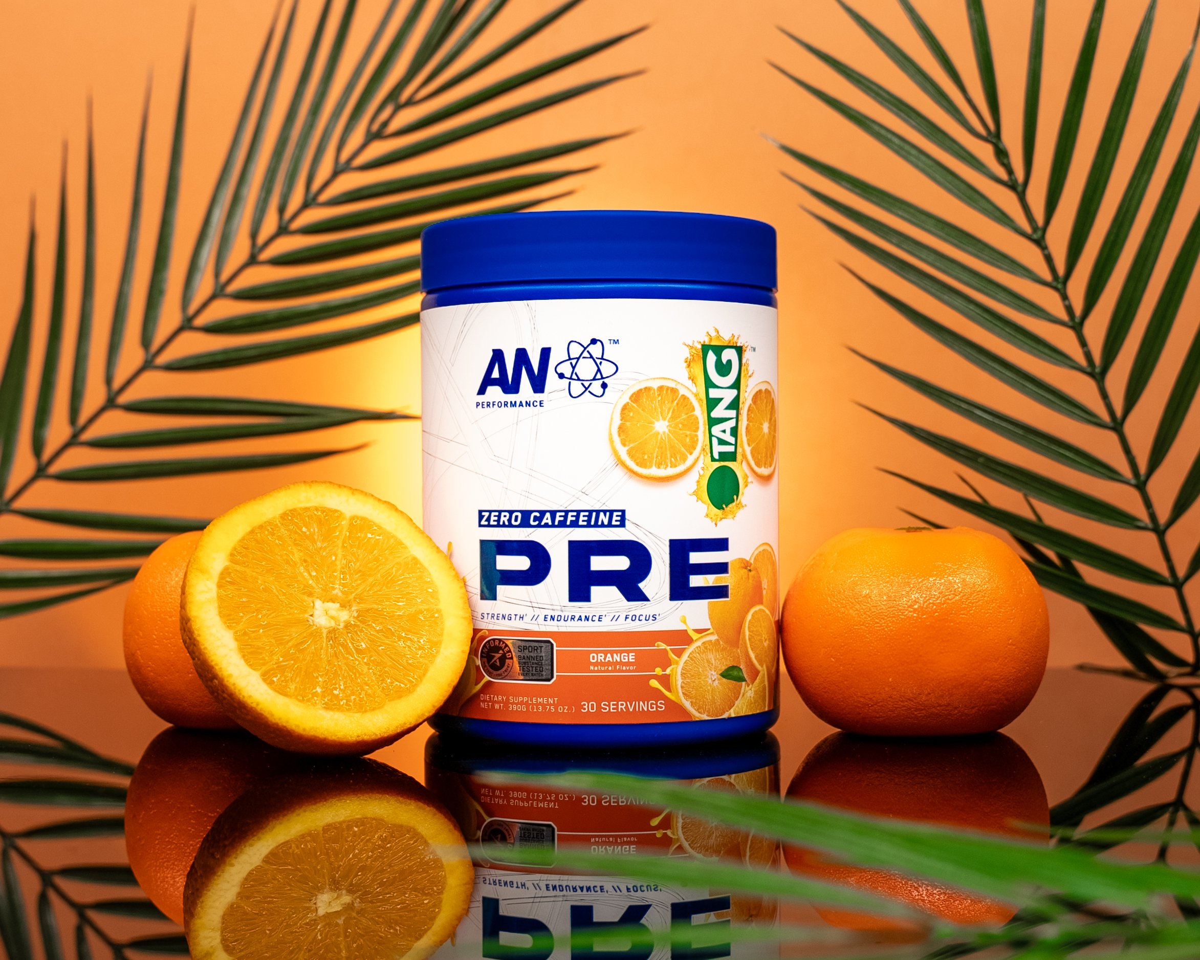
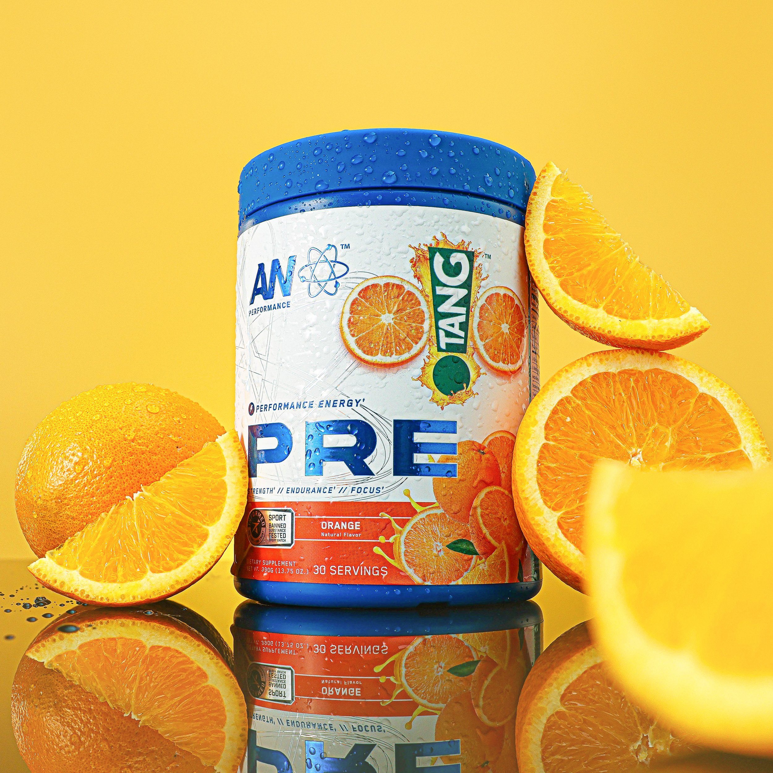
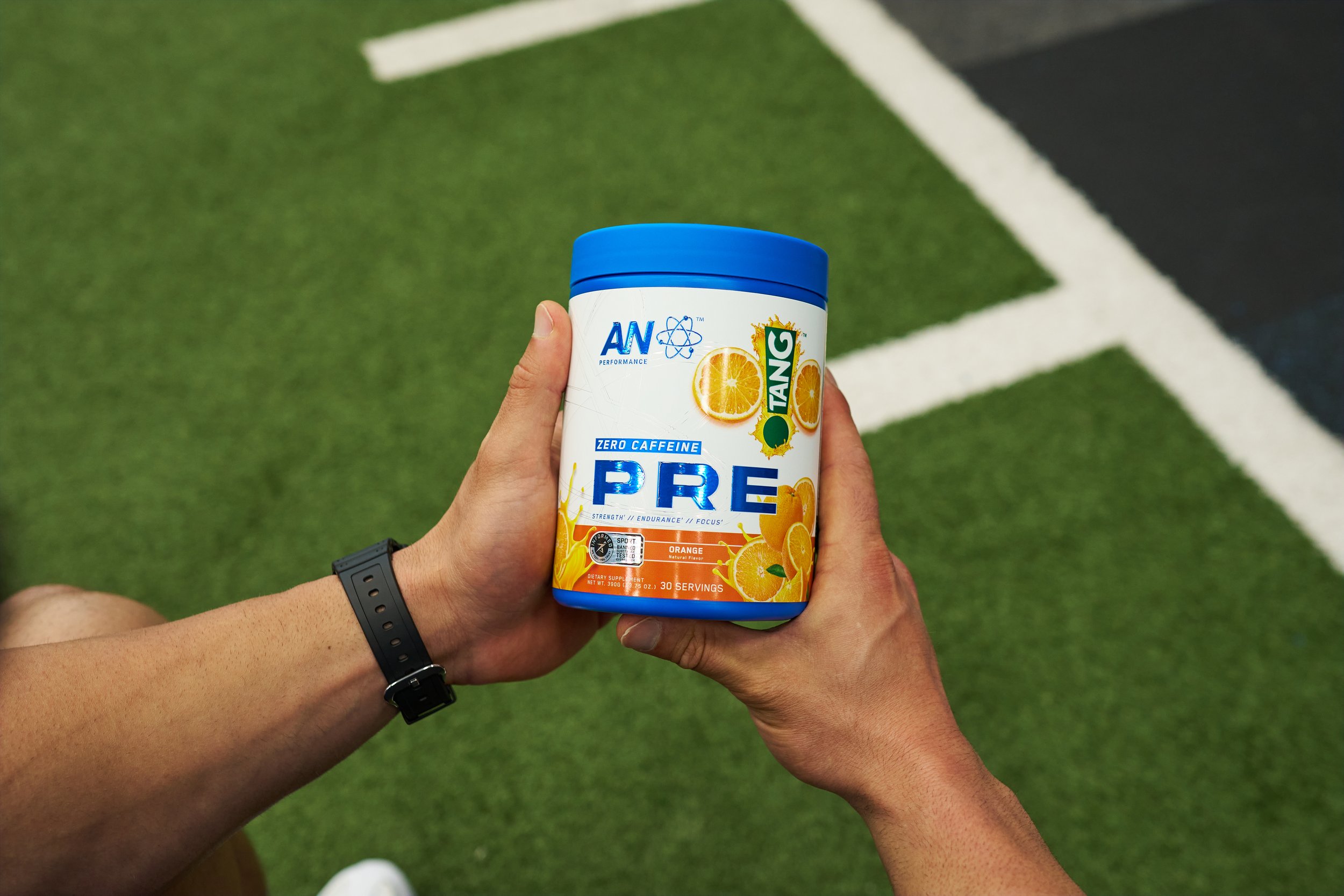
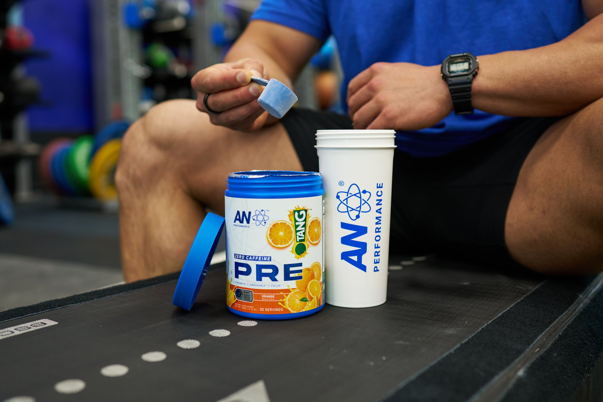
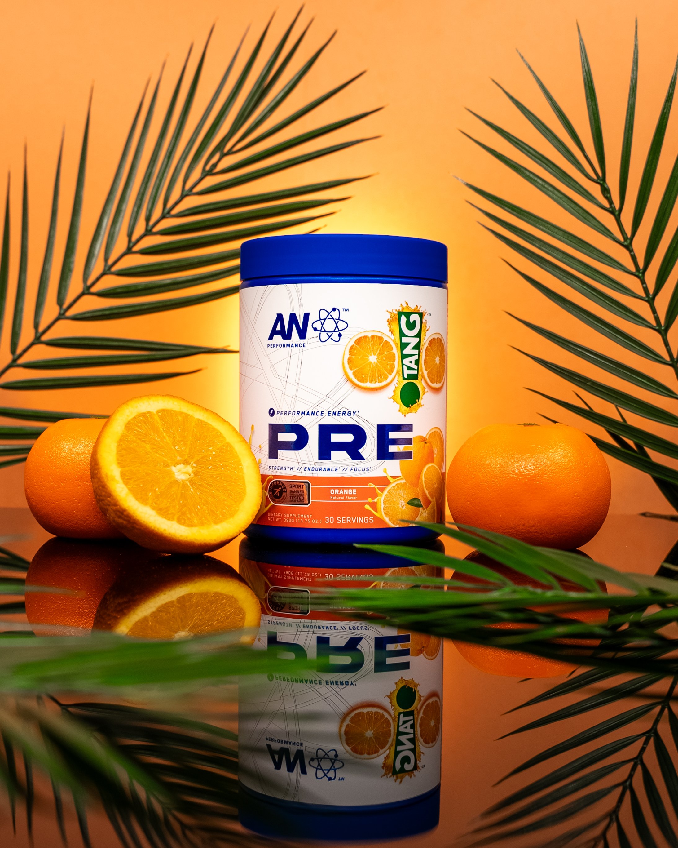
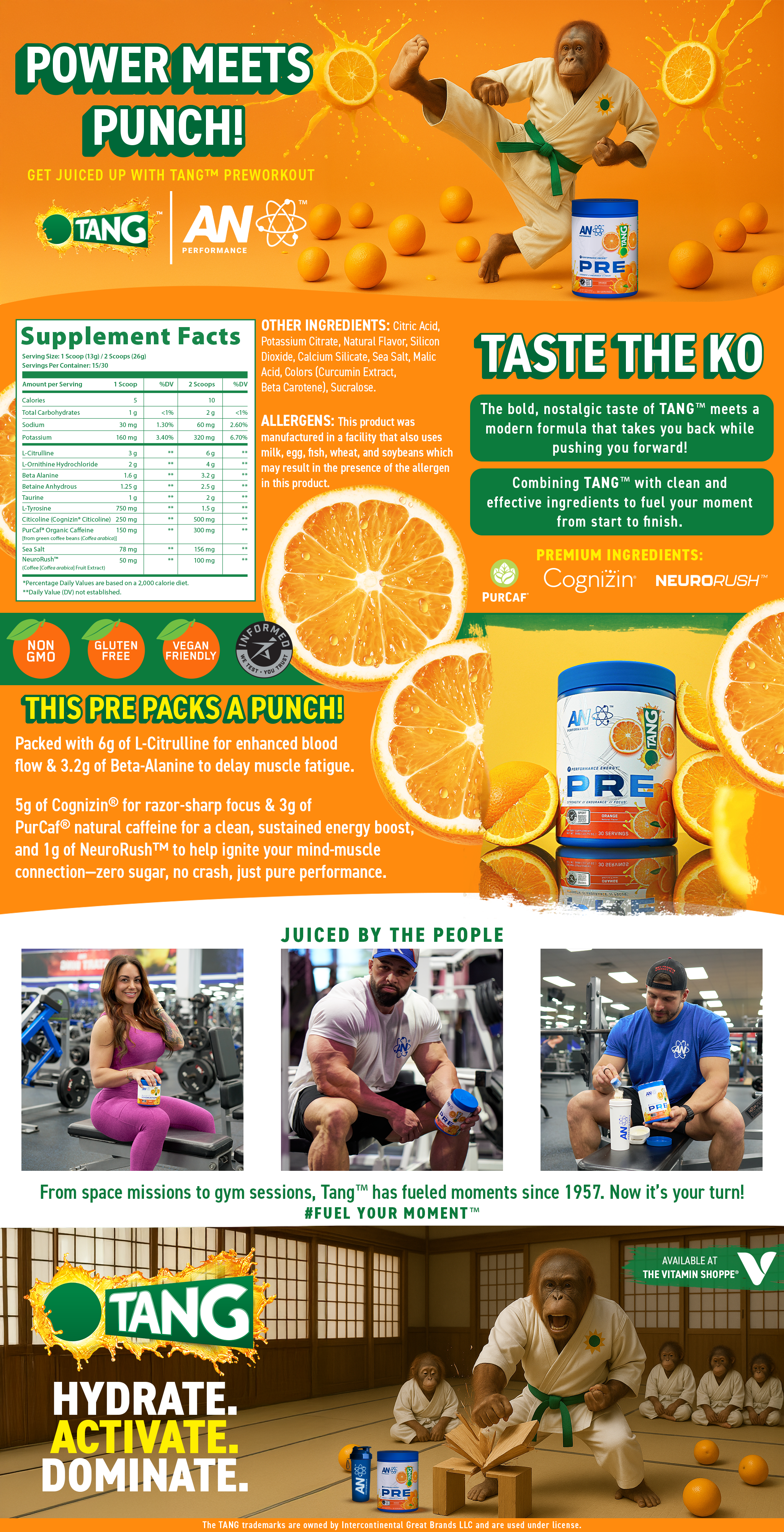
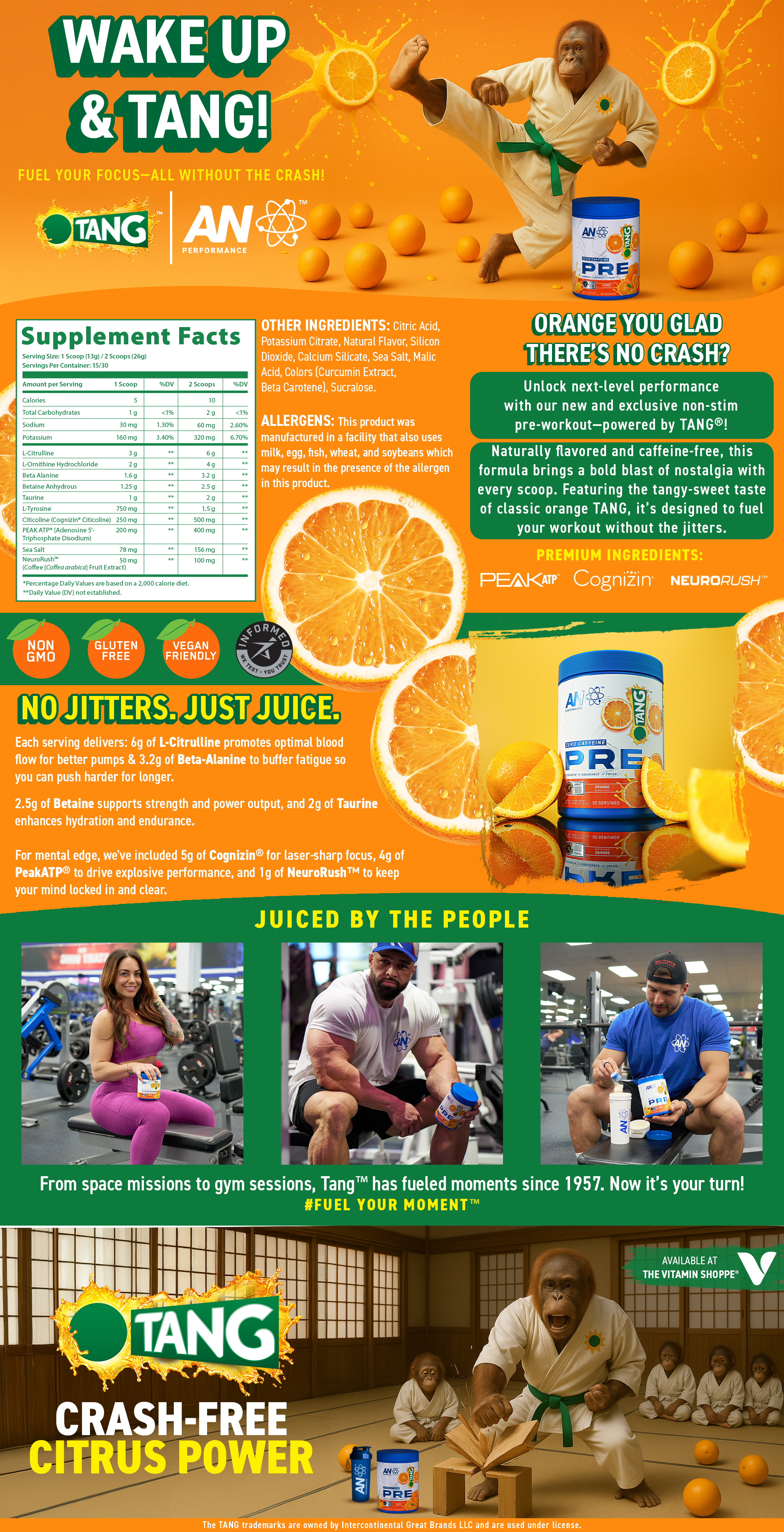
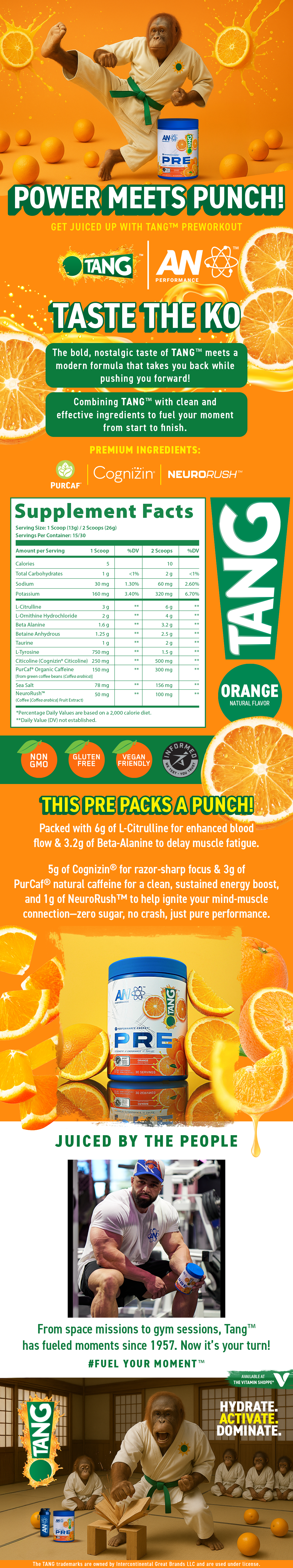
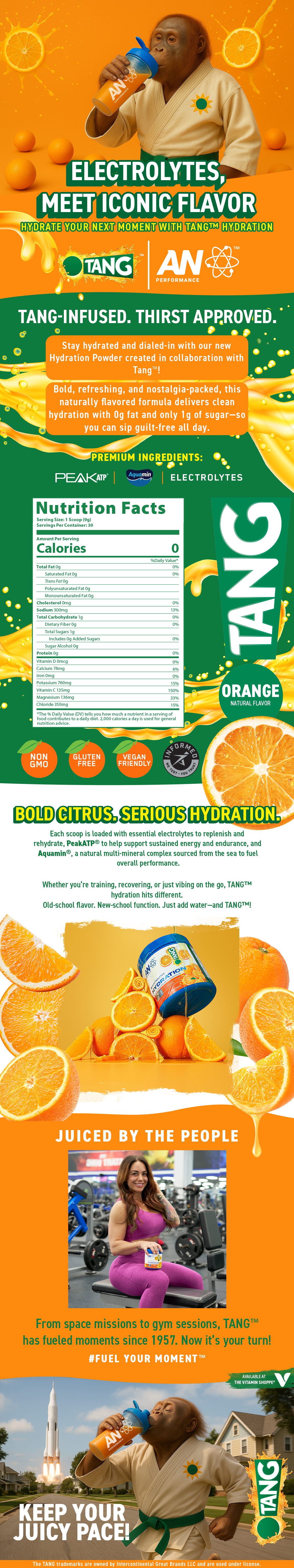
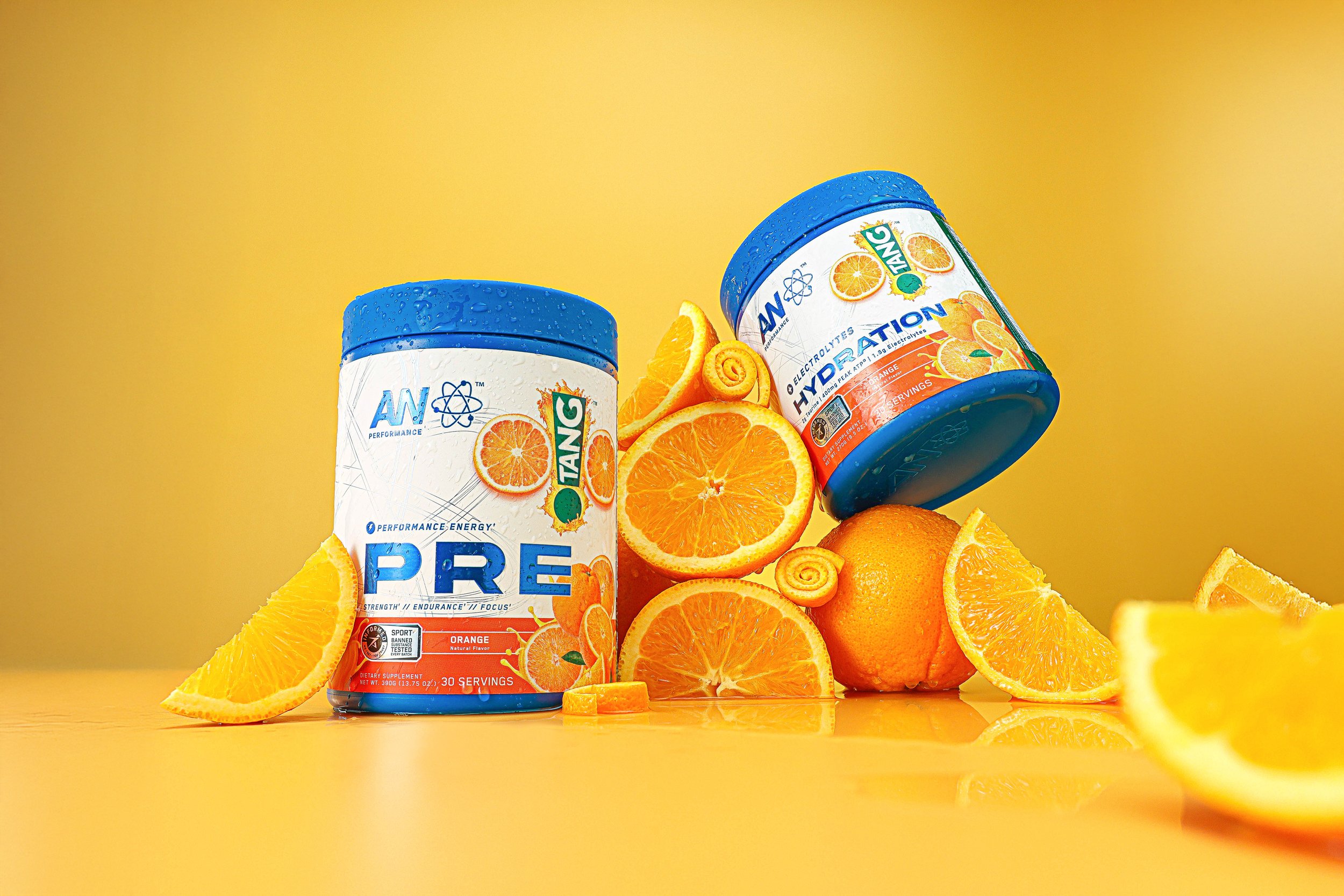
To strike that balance, we transitioned from the traditional TANG™ leaf icon to the bold exclamation mark; TANG™’s most recognizable brand symbol, bringing instant familiarity to longtime fans. Paired with a clean, luxury white base and vibrant citrus accents, the design bridges legacy and innovation, appealing to gym-goers and everyday athletes alike. This refreshed visual direction helped differentiate the new SKU while maintaining cohesion across the TANG™ product family.
The challenge
Modernize the nostalgic TANG™ identity for a performance-focused audience while aligning with the premium aesthetic of the AN Performance line.
Services
Packaging
Marketing Collateral
Product Modeling & Rendering
Web Design
Print Production
Email Marketing

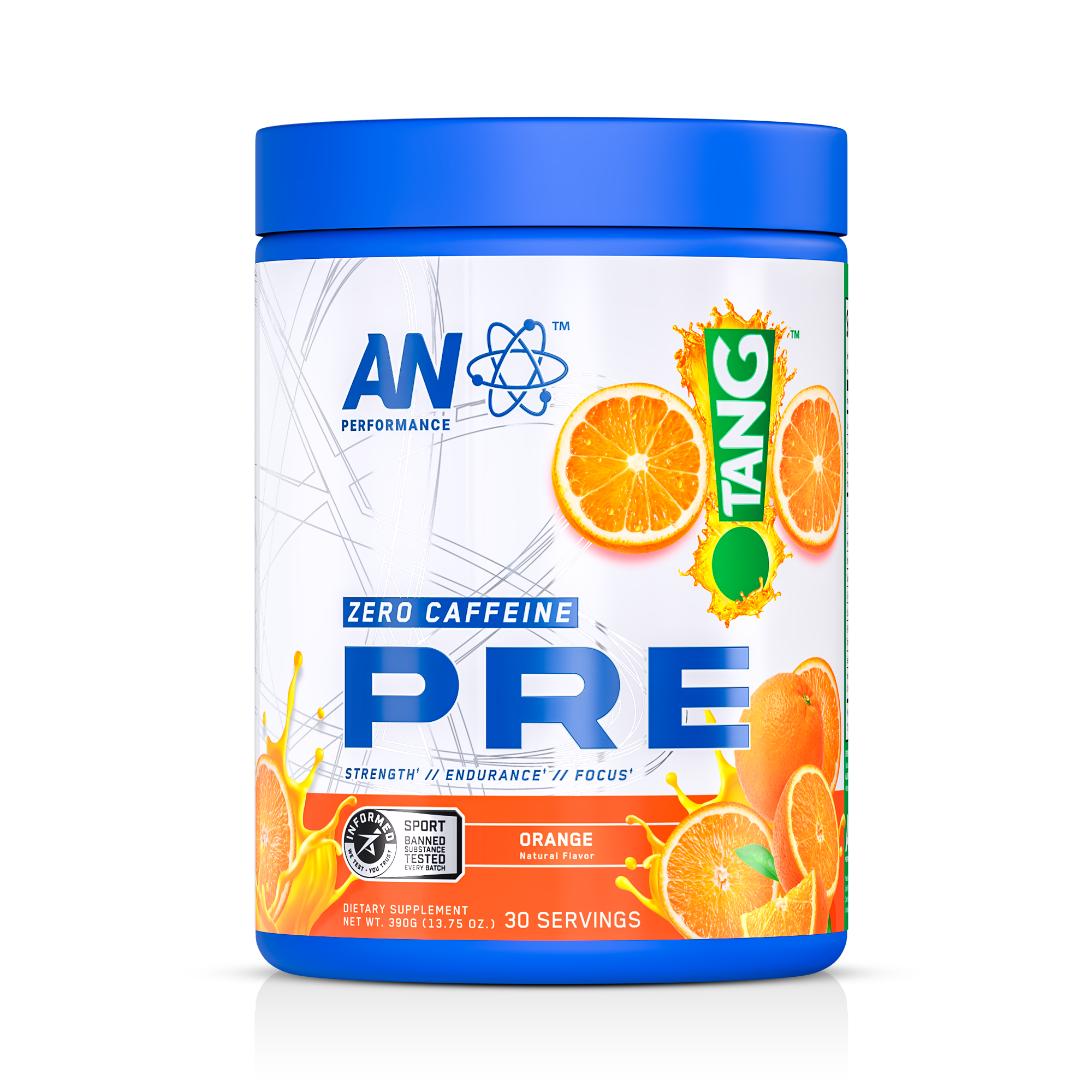
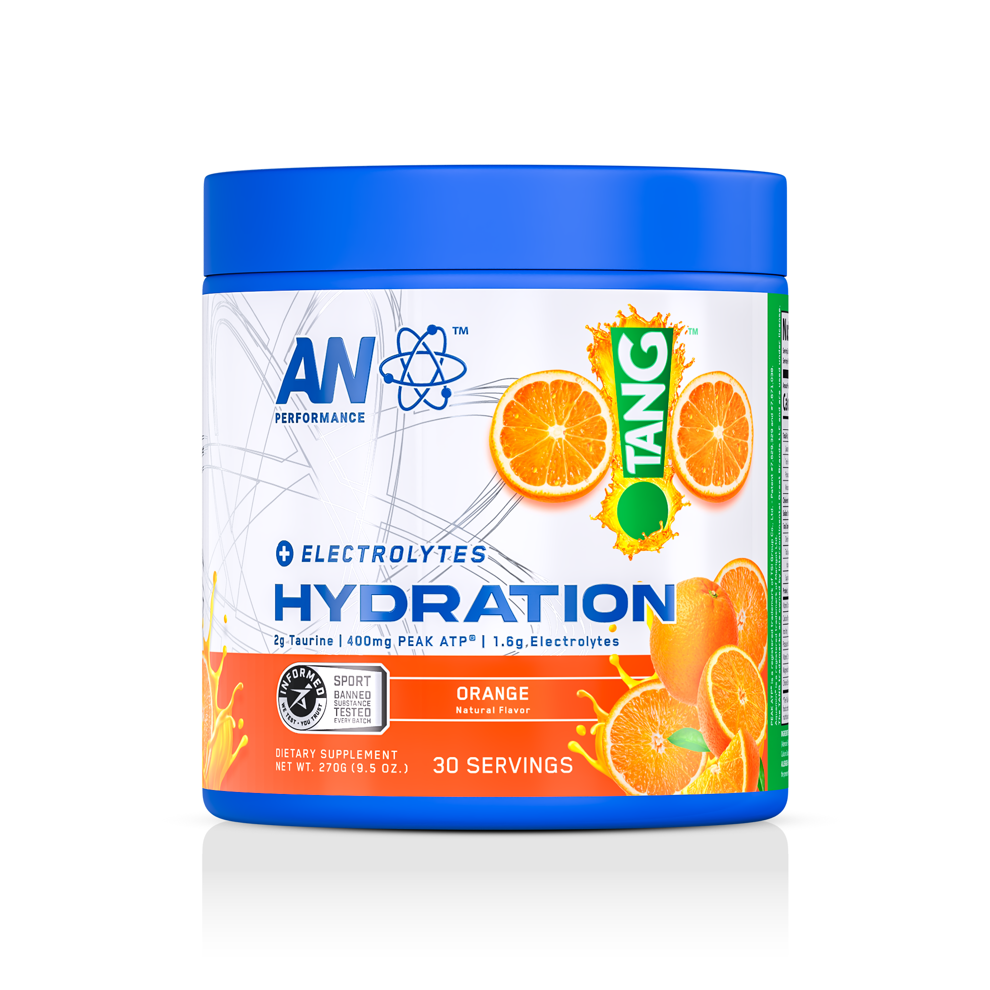
PACKAGING DESIGN